Dynamic Ranking Chart in Excel for Interactive Dashboards
A template example to create a dynamic ranking chart in Excel. The descending data bar chart is designed to visualize employee performance comparison by rating or sales on an interactive dashboard. This template demonstrates how to create a chart in Excel that automatically updates when data changes, along with employee photo sorting. This example is perfect for managers, analysts, or Excel dashboard developers.
Automatic ranking table of top employees in Excel
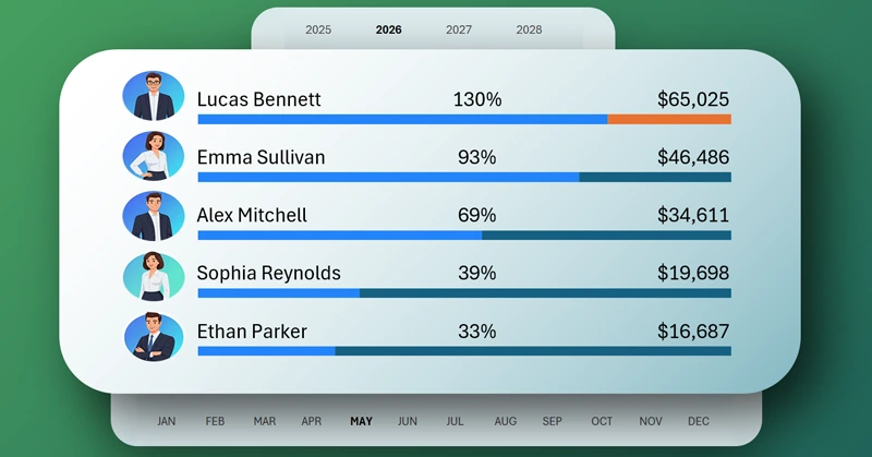
Data ranking is one of the most effective visualization methods for comparing employee performance in Excel. The chart is ideal for dashboards, interactive reports, or presentations that display data about top salespeople, products, or projects. Using a simple short video tutorial, you will learn how to create such interactive manager rankings in Excel on your own.
In this guide, you will learn how to create a dynamic ranking chart that automatically adjusts when the dataset changes. Lesson topics:
- Create a standard horizontal bar chart in Excel.
- Add another horizontal bar chart for manager photos.
- Fill the chart blocks with images.
- Formula for sorting manager photos.
- Create a block design for the ranking chart in Excel using shapes.
- Combine two bar charts in one block.
- Use pivot table slicers to control visualization.
- Presentation of the descending ranking chart capabilities in Excel.
This visualization block for analyzing manager sales rankings is effectively used on the Excel dashboard:
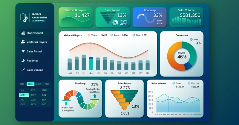
Excel dashboard for sales project management
By following this video tutorial, you will be able to create a professional real-time updating ranking chart. The visualization will give your Excel dashboards a modern, data-driven look.


Data Visualization Charts for Interactive Report Creation in Excel.
Dashboard Templates