Excel Template for an Interactive Grouped Bar Chart
An interactive bar chart with data grouping allows you to compare metrics by categories and reporting periods within a single visualization block. This Excel template simplifies analysis. It helps you quickly switch between entire data groups, making reports more informative and convenient for viewing and use.
How the Interactive Grouped Bar Chart Template Works in Excel
To build data grouping on a column chart, you first need to properly prepare the source data table. It is very important how the values for the X-axis are arranged. In this case, two columns are required.
- The first column contains the group name — these will be used as group labels directly on the X-axis of the bar chart.
- The second column of the source table must contain text data for the metric labels, arranged in the correct order within each group. This acts as a second-level row header for the source table.
In this way, you can build an interactive grouped bar chart. To understand the construction principle, a short tutorial video with a training example is shown below. There you will also find the template itself for hands-on practice.
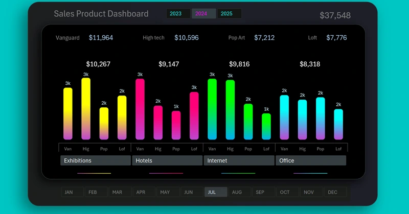
This visualization example works well together with other charts to form a full dashboard. Example of use:

Mini dashboard for grouped sales analysis in Excel
An interactive bar chart with cursors and data grouping in Excel turns tables into a powerful analysis tool. It helps you quickly identify differences between indicators, track trends, and make decisions based on clear visual data. This type of template makes dashboards easier to understand and more effective for daily work.


Data Visualization Charts for Interactive Report Creation in Excel.
Dashboard Templates