Fan Chart in Excel as a design concept for dashboards
A fan chart is an unusual and modern way to visualize data in Excel for specific tasks where segmenting summarized values is important. This chart works well for interactive dashboards, where not only informativeness but also visual appeal matters. This concept helps highlight key metrics and present information in a more striking format, like a presentation.
Example of a Fan Chart Template in Excel

Use a fan chart when you need to present 3 or more interrelated metrics. In more advanced versions, you can add an interactive cursor to highlight a selected value against other metrics. The principle of creating an interactive cursor for the chart can be the same as in the previous example. This visual format helps emphasize key metrics and makes reports more expressive.
To quickly learn how to build a fan chart in Excel on your own, use this tutorial video, which shows in detail:
- Create a standard doughnut chart in Excel and adjust the tilt angle.
- Hide segment lines by disabling the fill.
- Change the source for the chart legend data labels.
- Create a shape for the visualization block background design.
- Adjust position and size.
- Color all segments in harmoniously matching gradient colors.
- Use additional shapes to complete the composition design.
- Add and configure data labels.
- Add pivot table slicer buttons for interactive control.
- Test the fan chart presentation in Excel.
This fan chart template is effectively used in an interactive Excel dashboard:
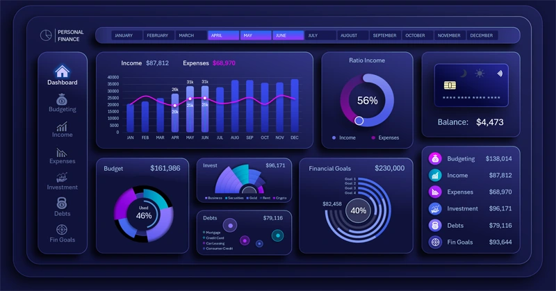
Beautiful dashboard for managing personal finances in Excel
A fan chart in Excel makes the dashboard visually expressive and modern. It helps highlight important data and present metrics creatively. Use this design concept idea to improve report structure and draw attention to key metrics.


Data Visualization Charts for Interactive Report Creation in Excel.
Dashboard Templates