Interactive Excel Line Chart with data switching option
This interactive line chart helps visually compare data and quickly switch between metrics in Excel. This approach makes the report more flexible and easier to analyze.
Interactive line chart template in Excel
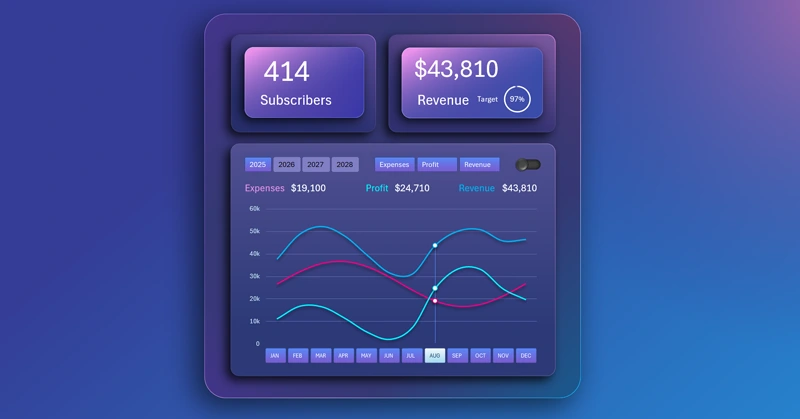
The interactive features of pivot tables in Excel allow you to create pivot charts and graphs controlled by slicers. This is useful for solving various tasks in visual analysis. This example shows how to temporarily exclude extra lines from the chart to improve readability and focus on a specific metric. In this way, the user can independently control the level of information noise in the data visualization – which is very convenient.
You can learn to develop an interactive line chart in Excel yourself. To do this, use the ready-made data visualization template and check out the training video tutorial, which shows the step-by-step development process:
- Design of the multicolor gradient background with different angles.
- Chart design base made from shapes.
- Blocks for KPI cards.
- Main block for data visualization.
- Adjusting the sizes of shapes for all template elements.
- Working with source data.
- Creating pivot tables with new calculated columns in Excel.
- Table of dynamic formulas for building an interactive chart.
- Adding pivot table slicers to create chart control buttons.
- Creating a helper pivot table to control curved lines on the chart.
- Building the line chart template with multiple curves and cursors.
- How to create a custom control element with a unique design.
- New design templates for pivot table slicer buttons.
- How to make a stylish line chart design in Excel.
- How to make dynamic data labels with formulas for auto-updating values.
- Filling KPI cards with dynamic labels and infographics.
- Presentation of the interactive line chart features in Excel.
This visualization block can be effectively used in building a universal dashboard in Excel:
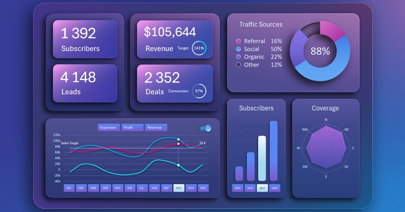
BI dashboard for SaaS sales analysis in Excel
The interactive line chart with switching makes visualization more convenient and informative. It helps focus on the right data and simplifies analysis for better information perception.


Data Visualization Charts for Interactive Report Creation in Excel.
Dashboard Templates