Interactive Excel spaghetti chart with line toggle
The spaghetti chart is used to display multiple lines representing different metrics over time. By adding an interactive toggle to turn lines on or off in an Excel chart, data analysis becomes easier. This is especially useful when you need to hide unnecessary lines and focus only on relevant trends. Cursors can also highlight data for a specific period. This approach makes visualization more flexible and convenient for dashboards.
Switchable Spaghetti Chart Template in Excel
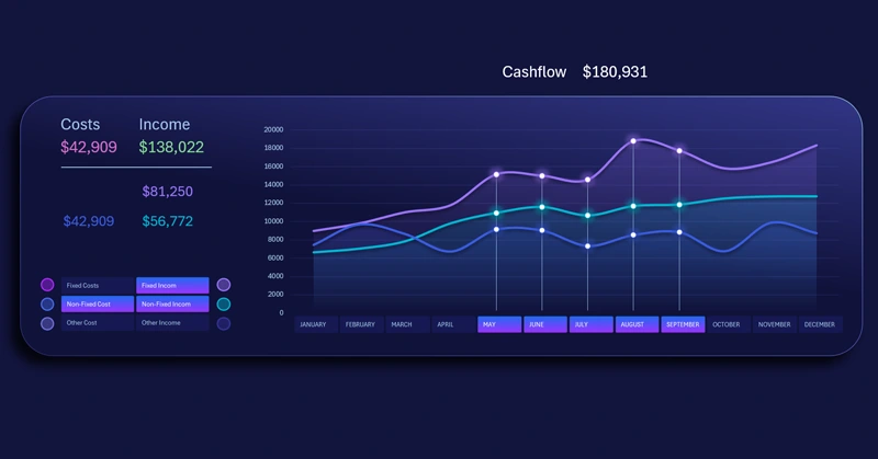
Pivot table slicer buttons are used to control the spaghetti chart as a toggle. It supports multi-selection, allowing users to set how many lines appear on the chart and specify which data series are displayed in the visualization.
Slicers are also used to manage cursors. Their buttons act as value labels for the X-axis. This method is very convenient and efficiently uses the visualization block space. It is particularly important when the spaghetti chart is used alongside other charts on the same dashboard.
To learn how to use pivot table slicers to create toggles for interactive charts and add cursors to a spaghetti chart, watch the tutorial video.
Video tutorial structure:
- Create a standard line chart template in Excel.
- Add pivot table slicer buttons to control the visualization.
- Add data series to create a semi-transparent fill effect on the charts.
- Change the chart type of new series to area charts.
- Apply a stylish color palette to the line chart design.
- Create cursors to highlight selected data on the visualization.
- Enhance the visualization block design with shapes.
- Test the interactive features of the spaghetti line chart in Excel.
This useful chart is frequently used in dashboard development. Example:
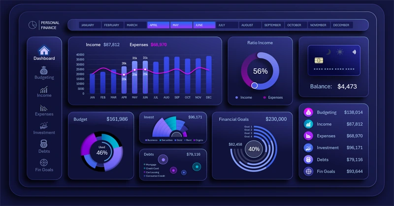
Dashboard for personal finance planning in Excel
The interactive spaghetti chart in Excel makes analyzing complex data sets clear and manageable. The ability to turn individual lines on or off helps focus on key metrics and improves visualization quality. Use this tool to enhance your dashboard and simplify multi-series data analysis. Analyze trends and identify patterns to determine key growth points where focused effort will yield the best results quickly.


Data Visualization Charts for Interactive Report Creation in Excel.
Dashboard Templates