Interactive Pie Chart with cursor for Excel dashboard design
Interactive elements make dashboards more user-friendly and easy to understand. A cursor chart in Excel allows users to control data segments, highlight key metrics, and quickly analyze major trends. This tool makes visualizations dynamic and improves report readability.
Beautiful Chart Template for Excel Reports

In this example, we aim to show that Excel's data visualization capabilities are much broader than they might seem at first glance. This is not about macros, but standard tools that allow creating stable, controllable interactive features for charts. For example, formulas, pivot tables, slicers, timelines, and form controls for developers. This way, Excel lets us create full dashboards as a comprehensive tool for managing business by visually tracking key metrics changes.
This example shows a multi-layered chart controlled by pivot table slicer buttons. To understand how the system works, use the ready-made template by downloading the Excel file at the end of the article. But to learn how to develop such visualizations yourself, one example is not enough. Below, a tutorial video shows the entire step-by-step development process.
Tutorial video structure:
- Create a standard donut chart template in Excel.
- Add a third data series in the chart settings.
- Move the third data series to the top additional layer.
- Apply a transparent fill to the second data series.
- Use gradient fills for the segments of the first data series.
- The third data series has transparent and colored segments.
- Add a pivot table slicer to control the cursor.
- Create a design by overlaying shapes for the visualization block.
- Enjoy the interactive features of the cursor chart.
This data visualization template is already effectively used in Excel dashboards. Example of an interactive report:
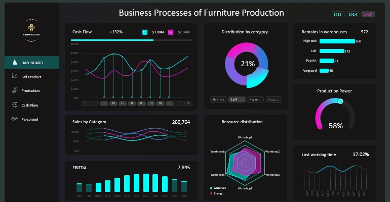
Dashboard for small business product sales analysis in Excel
An interactive cursor chart in Excel greatly improves the design and functionality of a dashboard. It helps highlight important data areas, speeds up analysis, and makes reports more user-friendly. Add this appealing element to your projects to enhance their presentation and usability.


Data Visualization Charts for Interactive Report Creation in Excel.
Dashboard Templates