Using a spider chart on an interactive Excel dashboard
Narrow-focused mini dashboards in Excel allow you to quickly evaluate key indicators without overloaded reports. A spider chart is ideal for comparing multiple metrics at the same time within a small application interface area. Combined with interactive elements, it becomes a convenient tool for visual analysis. This article explains an approach to using this chart together with an interactive bar chart on a compact dashboard.
Interactive Spider Chart Template in Excel
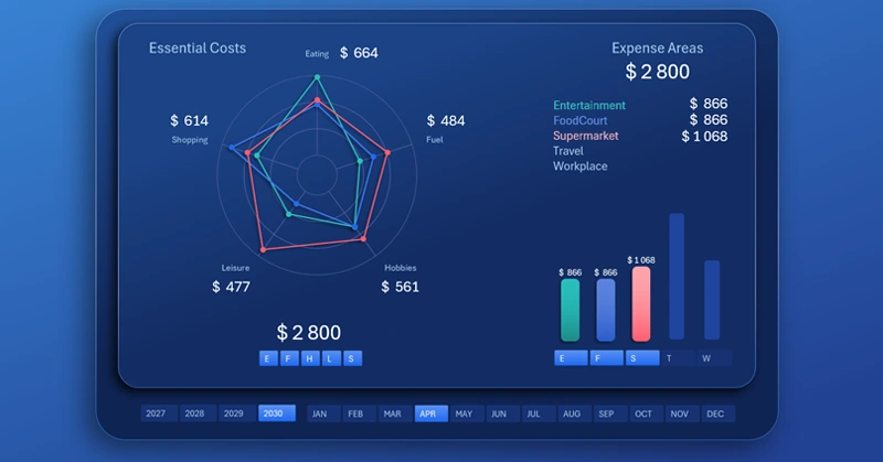
Use a spider chart on an interactive mini dashboard for clear comparison of interconnected KPI metrics. The interactivity of the charts is handled by control elements such as pivot table slicers. They allow you to selectively disable and group individual visualization elements on the mini dashboard. This is very convenient for analyzing narrowly focused interconnected data.
By holding down the CTRL key on the keyboard while clicking the slicer buttons, you gain more control over fine dashboard management. With this simple method, you can include or exclude a specific amount of visual information from the overall picture. This makes it easier and faster to find valid correlations and patterns in statistical values.
When can this be useful? Very often, reports are used to identify key growth points that have the greatest impact on results. An analyst can determine the target where it is most rational to concentrate the majority of efforts for the most probable growth and efficient use of resources. Every day we build hypotheses in reports. But this type of analysis allows us to be максимально prepared to confront our hypotheses with reality and leave a tangible impact on the course of events in our favor through rational influence. The battle must be fought at the planning stage, and then all that remains on the battlefield is to claim an already secured victory.
The mini dashboard template with a spider chart is located at the end of the article. However, it is better if you learn how to build a spider chart in Excel yourself. For this purpose, this video tutorial was created специально for you, where it is shown step by step how to:
- Create a circular web for a radar chart in Excel.
- Prepare source data for analyzing distribution by expense items.
- Prepare source data for analyzing expense levels by categories.
- Use shapes to create the base of the mini dashboard.
- An example of how to quickly build a spider chart in Excel.
- An example of how to make an interactive cursor for a bar chart.
- Use pivot table slicers as control elements for the mini dashboard.
- Configure the design styles for slicer buttons and set their placement and sizes.
- An example of how to create a bar chart with rounded columns in Excel.
- Connect data labels for selected columns.
- Adjust the colors of the lines and markers of the spider chart.
- Presentation of the mini dashboard with a spider chart in Excel.
All visualization elements of this mini dashboard can be effectively used on a large multi-screen dashboard. Example:
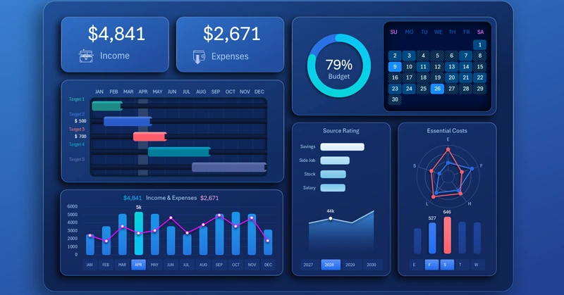
Dashboard template for effective personal finance management in Excel
A spider chart on an interactive mini dashboard in Excel helps quickly compare indicators and see the strengths and weaknesses of interconnected statistical data. This format makes analysis compact, informative, and convenient for regular use. It is an effective solution for monitoring KPI metrics and making timely decisions to achieve the best results.


Data Visualization Charts for Interactive Report Creation in Excel.
Dashboard Templates