How to Create Jitter Scatter Chart for Statistics in Excel
A Jitter Scatter Chart in Excel is the perfect tool for analyzing data structure when values are concentrated around each other or when there are many values but visually identifying the most common ones is essential. In a Jitter Scatter Chart, a "jitter diagram" method is used to scatter points along the X-axis, minimizing overlap between example values. For instance, if we examine the hourly rates of randomly selected male and female employees, results like 65 kg for females or 75 kg for males will repeat quite frequently, while anomalies will occur less often. Let's see how to create such a chart in Excel.
Jitter Scatter Diagram
In our case, we will attempt to visualize hourly rates of employees in a sample company on the diagram. The raw data is randomly collected based on statistical indicators and presented in a table with over 300 rows:
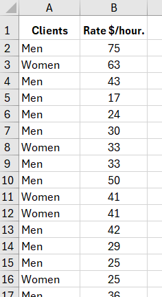
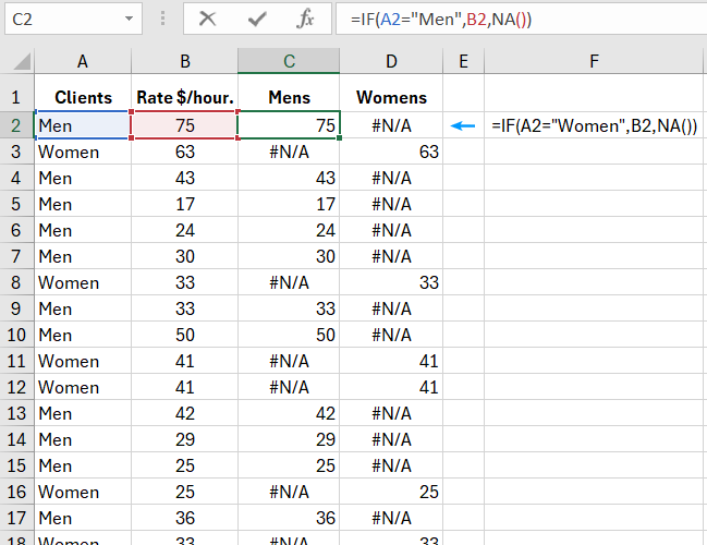
If we use a regular scatter chart for this purpose, let's add two columns with formulas where all statistical values are distributed separately for males and females:
Now, let's attempt to get a Jitter Scatter Chart. For this, select the range A1:D317, choose the tool: "INSERT" - "Charts" - "Insert Scatter," and we will get a chart as shown below:
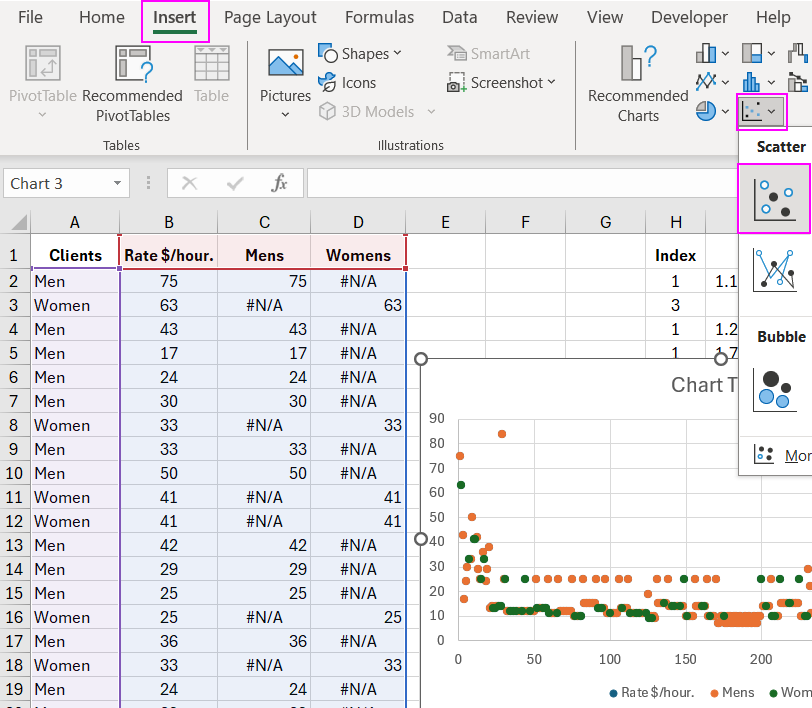
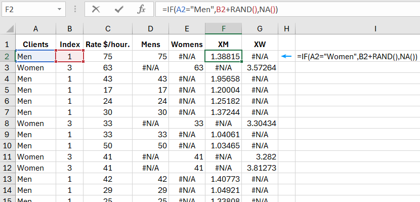
The result is not satisfactory. Add a column (Index) between columns A (Gender) and B (Hourly Rate $/hr) for X-axis values on the chart. In the "Index" column, use the formula =IF(A2="Man",1,3), which assigns an index number of 1 if male and 3 if female. Now, select the range B1:E317, and again, create a scatter chart: "INSERT" - "Charts" - "Insert Scatter."
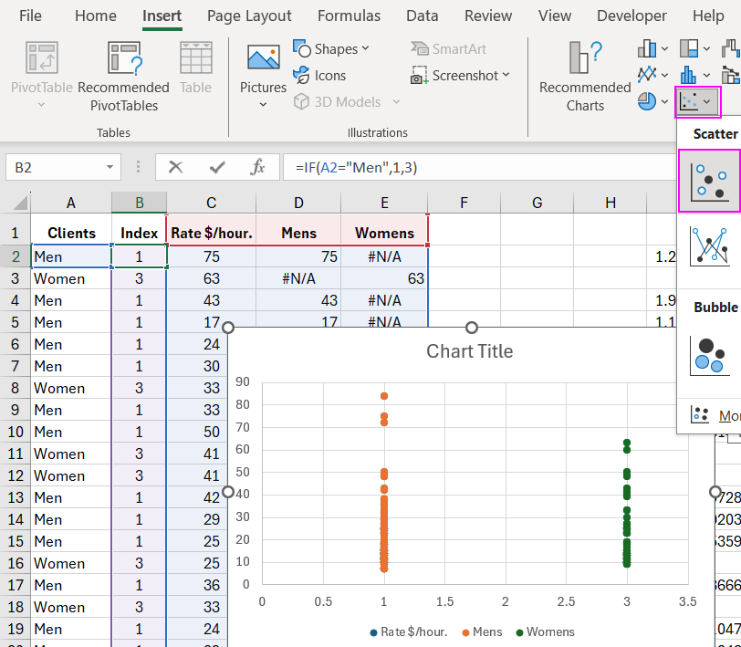
As seen in both cases, it is challenging to analyze the data distribution on the above charts as they are not readable. Controlled data scatter will help us, allowing us to obtain the following diagram.
How to Create a Jitter Scatter Chart in Excel
To create a Jitter Scatter Chart, add 2 additional columns to the original table named "XM" and "XW." In these columns, add a random number to the X-axis value from the "Index" column using the function =RAND(), which returns values always in the range greater than or equal to 0 and less than 1:
Formula for the XM column:
=IF(A2="Man",B2+RAND(),NA())
Formula for the XW column:
=IF(A2="Women",B2+RAND(),NA())
As shown below:
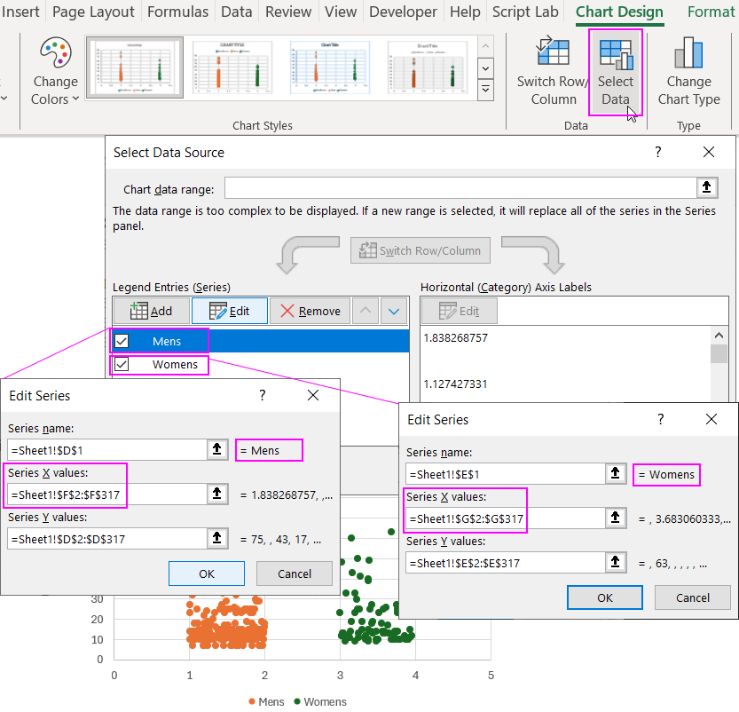
To create a chart for the male series, we will use the column named XM, setting it as the X-axis data, and the "Male" column as the Y-axis data. Follow these steps:
- Select the Excel worksheet column - F and D, then choose the tool: "INSERT" - "Charts" - "Insert Scatter."
- Activate the chart by clicking on it with the left mouse button and select the tool from the additional menu: "CHART TOOLS" - "DESIGN" - "Select Data."
- In the "Select Data Source" dialog box, in the left "Legend Entries (Series)" section, click on the "Edit" button and fill in the fields of the additional "Edit Series" window as shown below:
- Now, similarly change the range in the X value for the "Women" series.
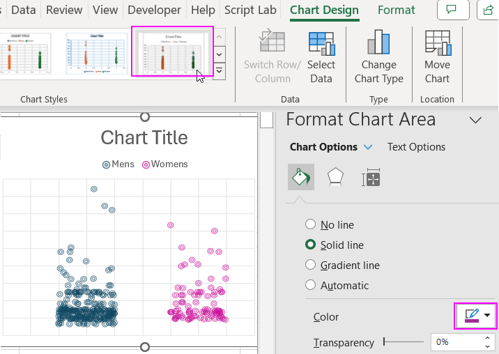
- Change the design layout in the chart settings:
 Download an example of how to create a Jitter Scatter Chart in Excel
As a result, you get the desired Jitter Scatter Chart. All that remains is to apply the desired formatting style to the chart. For example, it's better to have transparent dots, making it visually easier to analyze the most repeated values in the distribution.

Data Visualization Charts for Interactive Report Creation in Excel.
Dashboard Templates