Excel Dashboard for Small Business Credit Impact analysis
Analyzing the effectiveness of credit use in small businesses is a very responsible task. Borrowed capital deserves a dedicated dashboard in Excel. In this example, we’ll demonstrate the impact of credit on the growth or decline of profit margins and debt load in a small business. You can download the ready-made template at the end of the article — the file is in MS Excel format. But first, let's look at the structure of the interactive report.
Analyzing the impact of credit capital on small business in Excel
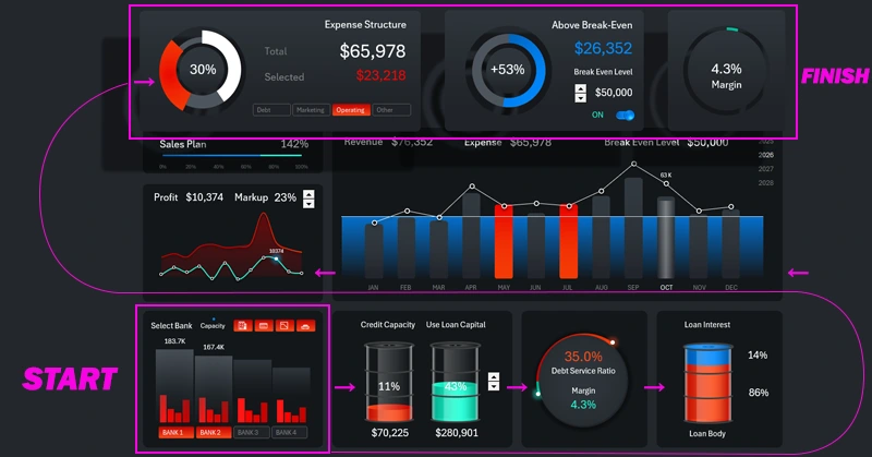
As shown in the diagram with directional arrows — this dashboard should be viewed starting from the bottom-left data visualization block to the top-right. We’ll follow this sequence in our narrative and analysis of the presentation structure.
There are many opinions on the benefits and risks of borrowed capital for small businesses. Many financial experts and analysts disagree: does a small business need credit? Yet everyone uses it, because if you don’t boost sales with additional financial resources, competitors will — and they'll gradually take up more market share. Let’s briefly review the pros and cons of lending for small businesses.
Advantages of banking products for small business financing:
- Fast access to funds.
- Support for working capital.
- Growth and scaling.
- Retaining equity in the business.
- Protection against cash flow gaps.
- Improved credit history.
- Tax benefits.
- Better settlements with suppliers.
Main disadvantages of loans:
- Financial debt burden.
- Risks of delays and penalties.
- Collateral and personal guarantees.
- Contractual restrictions from the bank.
- Overestimating potential and skewed real data.
- Debt dependency.
- Reduced liquidity.
The truth likely lies somewhere in the middle. Moreover, borrowed capital can both increase and decrease business profit margins, as well as profit itself. It’s important to maintain the right balance based on the financial conditions specific to the business. For this, it’s crucial to quickly assess nominal debt burden and monitor key microeconomic indicators of a small business. One of the best solutions is to use data visualization.
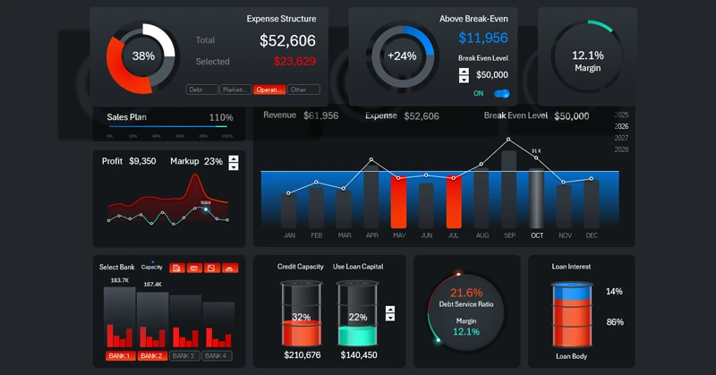
Comparing financing volumes across different banks
In this example, the first block is located in the bottom-left corner of the dashboard. That’s where the story of effective use of borrowed capital begins:
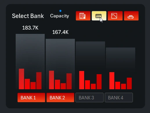
This is a fairly complex data visualization block showing how a small business can access additional financing through banking credit products. Different banks offer different terms, and they also impose different requirements. In this example, we analyze bank loans using a 4 x 4 matrix: for four banks, we evaluate four core banking products:
- Credit line.
- Business credit cards.
- Overdraft for small businesses.
- Leasing.
This interactive and multifunctional data visualization for comparing bank data includes two button panels for controlling the selection of the bank (1) or the product (2). At the bottom, a simple numbered panel switches between banks. At the top, another panel uses thematic mini-icons to include or exclude services. The grouped column chart with nested subcategories shows the final result of the selections.
And here is the last, less noticeable button for toggling between absolute and relative value display modes:
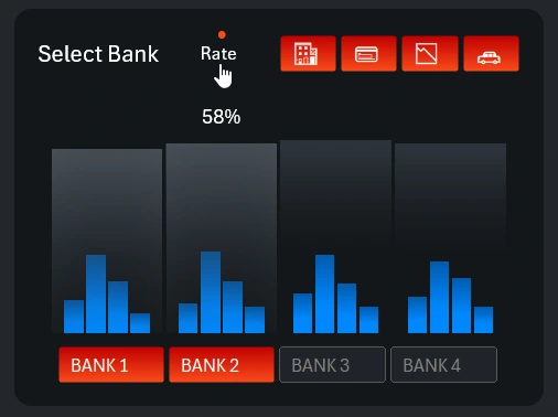
The financing volumes offered by banking services are shown in absolute values. Interest rates across different banks and services are compared in relative values (percentages). For example, in this image you can see that the business credit card service has the highest interest rate, especially at bank number 2.
On our website, you’ll find a full dashboard dedicated to this complex visualization block. There, you can analyze lending products in more detail and further segment by conditions. Possibly, this visualization block should have been a separate screen in this dashboard.
Managing the Share of Borrowed Capital
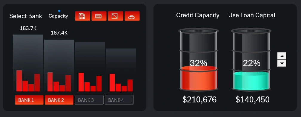
After selecting the banks and banking services, a total amount of borrowed capital is formed. But that doesn't mean it should all be used at once. It makes sense to inject borrowed funds into a small business in small portions to avoid stagnation in sales growth while preventing collapse.
To visualize the potential and actual levels of borrowed capital usage, the dashboard includes a special infographic in the form of two communicating vessels. The less in one, the more in the other—proportionally. This block also features a control element for adjusting the levels of borrowed and used funds. The control is a simple counter inserted from the Developer tab using Excel’s standard form controls.
Correlation of Margin and Debt Load on Small Business
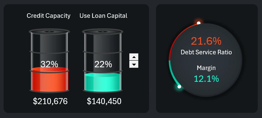
We gradually move to the next interconnected chart. As the amount of borrowed funds increases, the debt load also grows proportionally. However, the margin may change differently—not always proportionally, and sometimes even inversely, depending on specific conditions. For example, margin changes (up or down) can be influenced by markup rates. In addition, different conditions can affect the speed of margin dynamics. Business is not just a machine—it's a living organism where everything is interconnected and has its own meaning and impact on outcomes.
Ratio of Interest Payments to Loan Principal
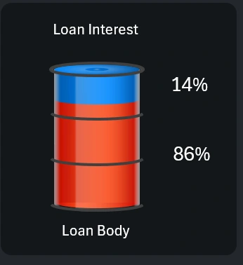
This infographic clearly shows how much of the profits will go toward paying interest on loans. If the loan principal is repaid through cost recovery, then the interest rate must always be lower than the markup. Otherwise, the small business will constantly operate at a loss and eventually go bankrupt.
The interest rate shown in the infographic is an average across all selected banks and loan products. The same applies to the loan principal. When working with the first data visualization block, it's important to monitor these levels when selecting banks for effective and beneficial cooperation.
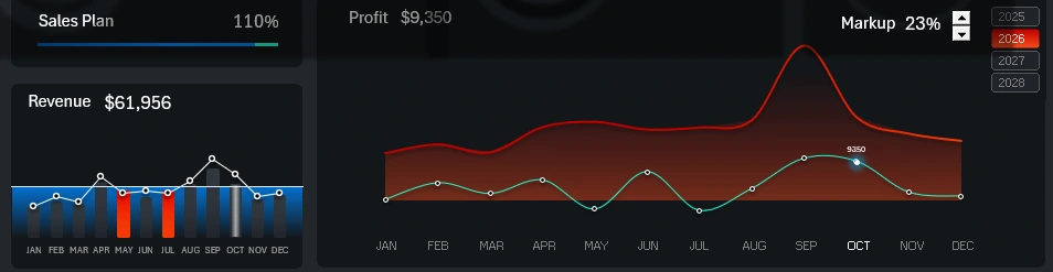
Revenue and Expenses Over Time
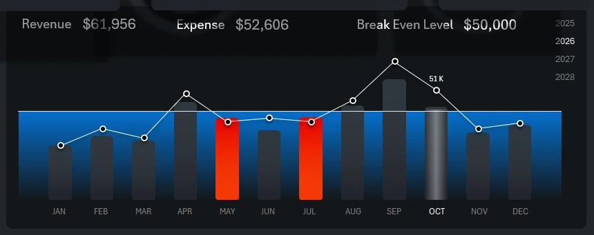
At the center of the dashboard is a large combined bar chart for analyzing income and expenses. The white line with markers shows annual revenue. Each bar represents monthly expenses.
The algorithm for highlighting bars in bright orange is simple. If monthly expenses exceed revenue, that month is flagged and the bar is highlighted. In this image, you can see that expenses in May and July were higher than revenue. However, the dashboard is currently analyzing October, as indicated by the light translucent cursor background and the highlighted white month name text in the chart’s X-axis label area.
The chart also includes another indicator—the average annual break-even level. This is a horizontal white line with a blue background across all months. Even if revenue exceeds expenses, falling below the break-even level is a negative signal. Sometimes, in the effort to cut costs, businesses fall below profitability. Here, you can evaluate how avoiding borrowed capital affects operations during tough periods. For instance, seasonality can significantly alter strategic business plans. In such times, it’s wise to have backup financial resources.
The break-even level in this dashboard version can be adjusted, changed, or even hidden from the data visualization.
This visualization block also includes dashboard controls for switching between months and years. This allows you to segment data for any selected reporting period. Multi-selection filtering lets you display data by quarter, semi-annual season, or any custom accounting period used internally by the organization.
Profit-to-Expense Correlation
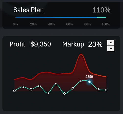
This is a summary analysis of the ratio between expenses and profit. High expenses don't always result in higher profits. It’s important not only to acknowledge this but also to track the impact trends on profit to control expenses. Additional funding through borrowed capital always brings extra costs, so it’s crucial to keep profit levels above the breakeven point.
This block also includes a control for adjusting the markup level to find optimal values. A high markup helps maintain high profits but can negatively impact sales volume. That’s why this block features a blue progress bar that tracks the annual sales plan. If the plan is exceeded, the extra portion is highlighted in green, as shown in the image. This is a good sign—the markup wasn’t too high. Healthy demand helped cover loan payments and kept profits above the breakeven point.
Pro Tip! In this dashboard version, you can toggle between two display modes for the main, central chart. If you click the profit-to-expense chart, it appears in the center for detailed analysis. Meanwhile, the revenue-to-expense correlation chart moves to the smaller left-hand position:
To return to the previous chart priority mode, simply click the smaller block on the left again. Different situations call for different focus areas.
Expense Segmentation by Category
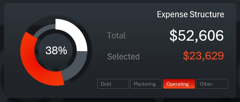
This time, the control element's authority is limited and does not extend beyond the data visualization block. All previous buttons controlled the entire dashboard as a single organism. However, sometimes local controls are useful for interacting only within a single chart without affecting other visualizations. This is a great example of implementing such a feature in Excel.
The chart allows for a visual comparative analysis of expense volumes across four categories simultaneously:
- Debt obligation expenses.
- Marketing expenses.
- Operating expenses.
- Other expenses.
This makes it easy to understand which month had what volume of expenses allocated, for example, to marketing. Or how much debt obligations exceeded marketing services in the specified month on the dashboard. When selecting any expense category from the button panel, the total amount of expenses is immediately displayed, and the cursor highlights the selected category in bright orange on the donut chart. The buttons are implemented using Excel Pivot Table slicers, so multi-selection mode is also available. In other words, you can select several categories at once.
Small Business Break-Even Controller
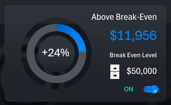
This visualization relates to the analysis of the break-even level on the main central large chart. This block shows how much higher or lower the revenue is compared to that level. The deviations are presented in both relative (percentage) and absolute (monetary) terms.
The block includes two control elements. Using the spinner, we manage the average annual break-even level of the business project. This level moves the horizontal line on the blue background on the main chart. The second element is a toggle button that enables or disables the visualization of this level on the main chart.
What's the Margin?
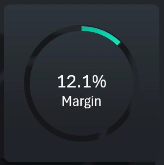
The final key metric gives us the answer to what we actually gain from using borrowed capital in a small business under certain conditions. In other words, it answers the ultimate motivational question — "why?" If you have a clear, positive answer to that question, you'll always stay motivated and ready to act. That is the true power of data visualization.
Presentation of Useful Tools for Credit Usage Analysis
Thus, the dashboard not only helps forecast and control the risks associated with using borrowed financial resources, but also motivates you to achieve new results.
Download the dashboard for analyzing the impact of credit on small business in Excel 
Using the data visualizations in this dashboard, you can model various scenarios when developing a small business scaling strategy. Analyze whether the lending conditions of different banks are favorable. Compare possible outcomes with and without borrowed capital under identical conditions.

Data Visualization Charts for Interactive Report Creation in Excel.
Dashboard Templates