Example of Excel interactive sales report with gamification
Interactive dashboard with gamification elements in data visualization design. Excel capabilities allow creating designs of various complexity levels. To demonstrate what Excel can do, this report template was developed — a template that will never be boring to work with.
Interactive dashboard with gamification elements in Excel
Gamification is rapidly gaining popularity and increasingly takes leading positions among other motivational technologies. The main advantage of gamification is that it makes work more enjoyable by adding game elements to processes. Employees can focus on their work more easily. They do not burn out when achieving results. At the same time, their work efficiency increases significantly.
This template is an example of how Excel can incorporate game elements into analytics design for reporting. It is quite a controversial approach, but it certainly attracts attention. Here we are not looking for perfect solutions, as they do not exist, but there is something to this approach, and it may have potential for further development. In short, it’s worth trying because the concept is just too interesting.
Sales report presentation with game elements
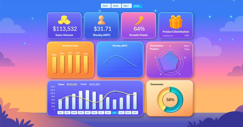
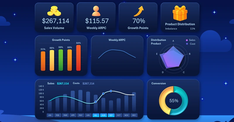
Functionally, the interactive dashboard template is designed for sales performance analysis. At the very top are the dashboard KPI cards, forming the header grid with summary sales data:

- Sales volume.
- Average weekly revenue per customer.
- Growth points of results.
- Imbalance in the distribution of sales volume and implementation costs by main product categories.
Above the dashboard header is a block of buttons for switching between years. You can select historical data for multiple years at once or all years together. This is made possible by Excel PivotTable slicer buttons.
Next, each KPI card is given a dedicated data visualization block. First comes a comparative analysis of the performance of 5 growth points where efforts were applied:
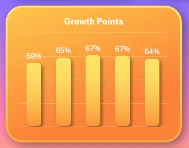
Now you can see which KPI category has the most impact on overall sales results.
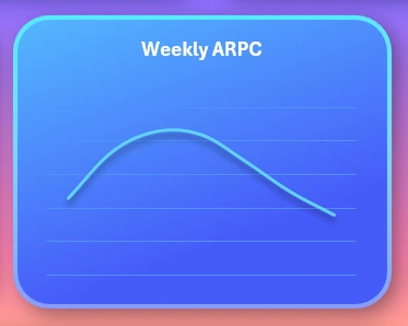
The curve of average weekly revenue per customer (ARPC), which changes its dynamics depending on the day of the week.
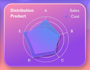
A radar chart for analyzing the distribution of sales volume and implementation costs by main product categories for the selected reporting period on the dashboard:
A combined chart for comparative analysis of monthly sales volumes and costs:
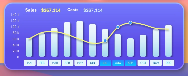
This block contains a set of buttons for switching between months on the dashboard. Multi-selection is possible to choose several months at the same time — for example, to analyze a quarter. The image shows how the dashboard was set to display data for the third quarter.
The last visualization block is for conversion analysis:
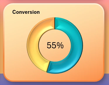
For example, analyzing the conversion of visitors into buyers for retail stores, or analyzing the conversion of orders into closed deals.
Dashboard design with gamification elements in data visualization
The dashboard template provides a total of 4 design modes for different times of the day when working with the report: day, night, morning, and evening. For example, here is how the dashboard appearance changes when switching to night mode:
Download the Excel dashboard with gamification design 
All other modes (morning and evening) are available in the template file.
As you can see, Excel can be used in many different ways for developing data visualizations. The wide capabilities of Excel make it possible to bring various creative ideas to life. It makes sense to use them in daily work to search for and apply new solutions, not only in the field of employee motivation or data presentation.

Data Visualization Charts for Interactive Report Creation in Excel.
Dashboard Templates