Excel Payroll Dashboard for Teal Organization Self-Management
Teal business-style dashboard design for reporting in self-managed Organizations in Excel. Every product always has two types of value: practical and emotional. This template clearly demonstrates how to create an emotional component for a practical payroll report in a Teal company.
Dashboard Template for a Self-Managed Organization in Excel
We are living in a unique era of shifting narratives in the labor market. The Gen Z generation is setting new rules for the business world—not only as consumers but also as employees. Their new narratives can confidently be called revolutionary. Gen Z has a completely new approach to modern life, and it is becoming increasingly difficult to criticize it. For example, they introduced “micro-retirements” (short-term employment for a couple of years to save money for a year-long world trip at an active age). This may not be entirely new, but it inevitably raises the question: “Was that always an option?”.
As they become leaders, Gen Z builds Teal Organizations. This is a new corporate culture where employees take on more responsibility in exchange for greater freedom in decision-making.
The structure of Teal Organizations is built on three pillars:
- Self-management. All decisions are made not top-down, but directly by those who perform the work. Instead of a fixed position, there is a role that can be changed depending on the situation.
- Wholeness. In Teal Company, there are no hierarchical status uniforms. On the contrary, being yourself is encouraged. This reduces emotional energy costs.
- A clear evolutionary purpose is required. The growth mission of a Teal Organizations is more important than profit. Profit serves as “fuel” to achieve goals but is not the goal itself.
As a result, both managers and employees experience less stress and more satisfaction from work due to a better life balance.
This approach is controversial but also very attractive. Especially since traditional management models (orange Company) are becoming less effective in modern conditions.
Employee salaries in Teal management systems also act as fuel, while the ultimate goal is the full realization of individual potential and finding meaning in daily work.
This dashboard template is designed for analyzing payroll fund expenses in Teal Organizations. Therefore, a business-style dashboard design in Teal tones was chosen.
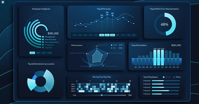
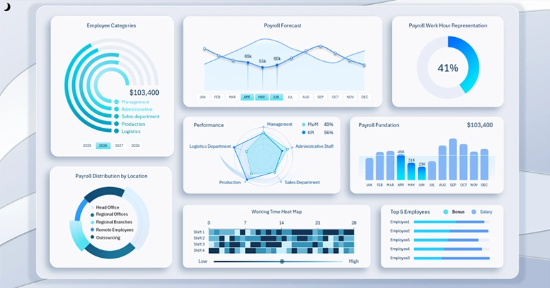
Structure of Monthly Payroll Distribution by Departments
Distribution of monthly payroll fund payments across employee categories:
- Managers.
- Administration.
- Sales department.
- Production department.
- Logistics (transport, packaging, and warehousing).
The data is effectively displayed using a radial bar chart.
This dashboard block also includes buttons for switching between years. The permissions of this control extend across the entire dashboard. The template’s interactivity is implemented using pivot tables, which serve as data sources for all charts. These pivot tables are controlled via special filter buttons—Excel pivot table slicers.
This approach allows users to perform grouped data selection by choosing multiple buttons simultaneously for a reporting period. For example, selecting all years at once will display aggregated data for all four years.
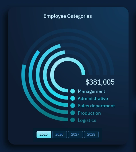
Forecast vs Actual Payroll Payment Chart Including Bonuses
Teal Organizations also use bonuses, but they operate on a completely different principle. In traditional “orange” corporations, bonuses are short-term incentives for meeting sales or KPI targets. In Teal Organizations, they are rewards for development. This motivational approach is borrowed from gamification techniques—leveling up roles through achievements. The entire bonus system is designed with the understanding that the development of one employee should contribute to the growth of the entire business.
The chart displays two lines:
- Foreground – a line chart with a cursor representing the actual monthly payroll payouts.
- Background – a chart of planned payments, including bonus rewards for employee development achievements.
In this block, instead of month labels on the X-axis, there is an interactive button panel for switching between months. The functionality of these buttons applies not only to the chart but to the entire dashboard. This is also implemented using pivot table slicers and supports multi-selection. For example, you can select multiple months to analyze quarterly data.
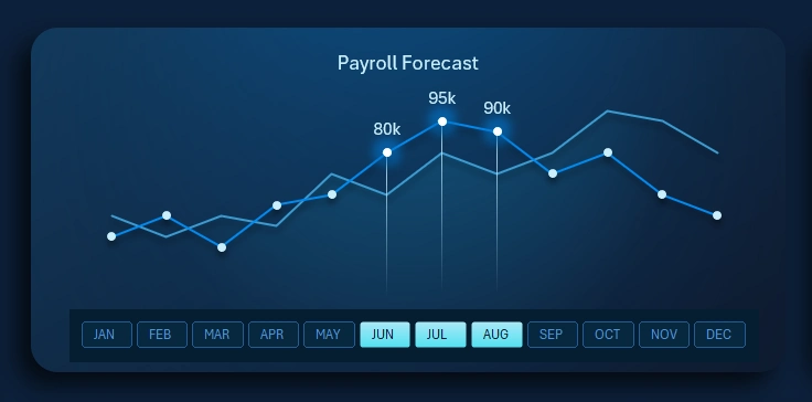
Distribution of Growth Metrics by Company Departments
The radar chart shows the distribution of growth metrics across each department for comparative analysis. This allows evaluating the rationality and effectiveness of the payroll expense structure.
As mentioned earlier, growth is the primary mission for a Teal company. Therefore, KPI and MoM indicators are also present here, but they are used in a more democratic way. For example:
- KPI in a Teal company is a self-diagnosis tool, not a whip for forcing bonus payouts for exceeding growth targets.
- MoM (Month-over-Month) for Teal leaders acts as a “pulse” indicator. It helps determine the company’s stage of development and whether it is experiencing growth or stagnation depending on current market conditions.
It is important to note that endless growth for the sake of growth (MoM+) is always a questionable goal for Teal Organizations. It is essential that each objective is not only ambitious but also achievable. The clearer the goal, the closer we get to it.
Payroll Fund Inflow
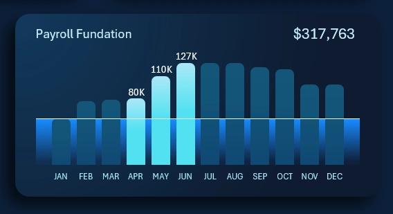
Everything here is straightforward. Each bar on the chart represents the monthly inflow volume into the payroll fund. The horizontal line across all months represents the average annual inflow plan. The cursor highlights the months selected on the dashboard for analyzing the total amount. In this example, the image shows the total payroll fund inflow for the second quarter.
Heatmap of Activity Across Four Work Shifts
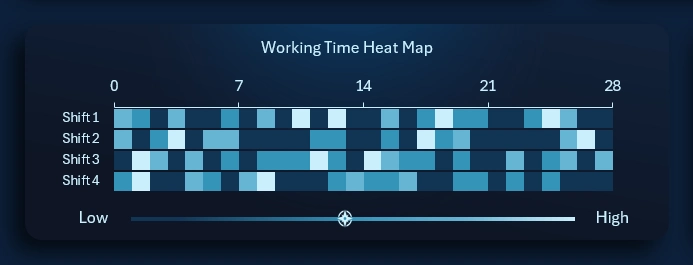
The heatmap allows analyzing daily activity across different work shifts. In this template, data for four shifts is analyzed simultaneously and in parallel.
Each square represents one of the four shifts on a given working day. The X-axis represents weekly periods (number of squares horizontally).
Each square’s color indicates the level of activity. The legend below is displayed as a horizontal histogram. Dark tones represent low activity, while bright tones indicate high activity. The cursor on the histogram shows the average value over the last 28 days.
This visualization uses a 28-day calendar format. The four-week reporting cycle is very popular in industries where comparability of data across current, previous, and future periods is important. For example, it is often used in retail, food service, and manufacturing.
There is an idea that it would be better to have 13 months in a year, each with 28 days, plus one holiday day. This is known as the fixed calendar or the Comte calendar. However, such a calendar would have a significant drawback for reporting, as it would not allow dividing the year into quarters, months, or half-years.
Interesting fact! Eastman Kodak implemented a 13-month, 28-day calendar into its internal corporate culture, and it was used for 60 years—from 1928 to 1989. However, increasing standardization requirements in the external business environment made it difficult to maintain two calendar formats within the company. As a result, Kodak was forced to abandon the fixed calendar in favor of standardization and alignment with the external business world.
Leaderboard by Achievements and Rewards
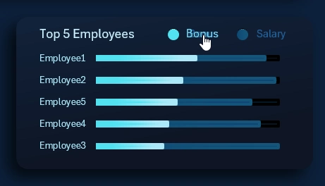
It may surprise you, but Teal Organizations also use leaderboards. However, they operate on a completely different principle. Here, the leaderboard is less a motivational tool and more a diagnostic one.
If an employee’s sales decline, top performers offer support and show genuine interest in understanding what happened. The growth of the entire company depends on each individual. At the same time, less successful salespeople can learn from top performers to improve their skills. There is no competition here because all employees are interconnected.
This chart allows analyzing leaders based on achievement levels (bonus rewards) and financial compensation levels. Use the interactive legend buttons on the horizontal bar chart to sort in descending order by either metric.
Multi-Level Data Segmentation Chart
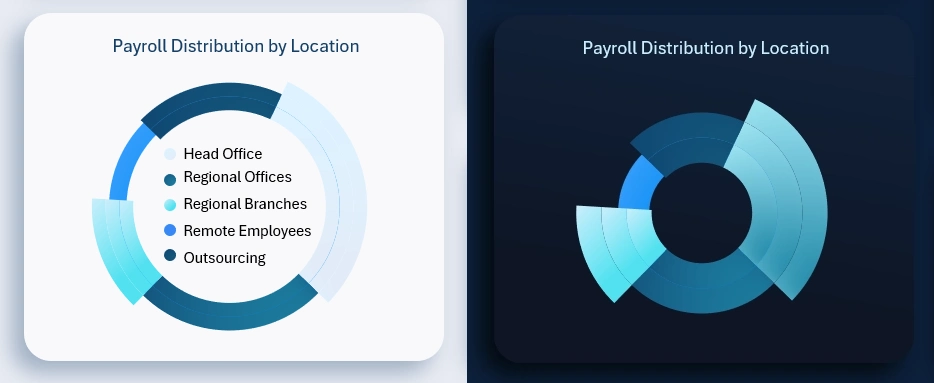
This visualization enables a high-level analysis of how payroll fund resources are distributed for employee compensation across locations:
- Head office.
- Regional offices.
- Regional branches.
- Remote employees.
- Outsourcing.
When the reporting period selection changes, the data updates automatically.
Representation of Working Hours in Percent
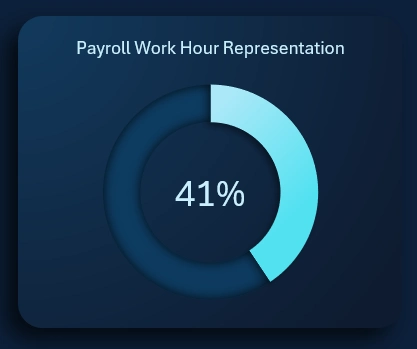
This metric also works differently in a Teal company. In traditional “orange” organizations with vertical management structures, it is used to control payroll efficiency. In horizontally managed, self-organized Organizations, the percentage of working hours acts as an indicator of burnout risk.
Analyzing workload in terms of working hours helps preserve the energy potential and physical resilience of employees.
Dashboard Design for a Teal Company in Excel
Business design in the office often reinforces corporate culture and employees’ sense of belonging. It is also important to invest time in enhancing the emotional value of practical reports.
The dashboard also has a light design version for comfortable use in bright sunlight or well-lit environments:
This modest Excel dashboard template can serve as a source of inspiration for developing useful software with both practical and emotional value for its users:

Download Dashboard for a Teal Organizations in Excel
You can freely modify and improve the dashboard according to your specific needs. This prototype is not complete, but the hardest part is getting started—and you already have that. Now let your creativity guide you and do not limit your ideas.

Data Visualization Charts for Interactive Report Creation in Excel.
Dashboard Templates