Combined Chart for KPI Plan Testing in Excel
Meeting the revenue KPI plan is not a final verdict at year-end — it's a monthly dialogue between strategy and reality. When the actual revenue curve and the plan line are visible on the same chart, the gap between them stops being a reason for panic and becomes a signal for action: adjust the scenario, shift the focus, strengthen the right direction. That's exactly why the dashboard includes three interactive tools — and each one changes not just the look of the chart, but the angle of management thinking.
Functional Data Visualization Design in Excel

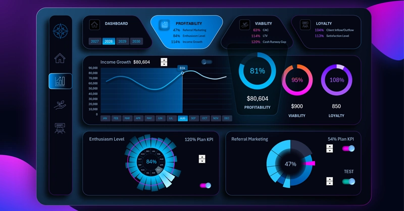
The interactive chart block is designed for strategic planning of revenue growth through effective planning management. The revenue growth line chart relative to the monthly KPI plan trend line targeting growth consists of:
- Blue curve — actual monthly revenue.
- Red diagonal line — the 100% KPI plan completion benchmark.
- Background bar chart — divides the year into before and after periods.
Based on the layout of visualization blocks on the dashboard, the right side shows a summary chart of the average plan completion percentage across all dashboard metrics. See the full picture as a practical example of using combined charts on a dashboard for KPI plan testing in Excel:
Dashboard for Managing KPI Plans in Excel
The revenue KPI management block is a concentrated dose of management logic packed into a single visual space. The plan line adjustment spinner lets you model scenarios in real time during a planning meeting without opening any new files. The toggle hides the plan line when it's more important to see the clean actual trend. And pivot table slicers make it possible to view the same data across different time horizons — from a single month to four cumulative years. When all three tools work together, KPI stops being a number for the report and becomes a working compass for the entire team.
 Download the Combined Chart for KPI Plan Testing in Excel
Data Visualization Charts for Interactive Report Creation in Excel.
Dashboard Templates