KPI Dashboard for Startup Project Management in Excel
Everything that can be measured can also be managed. KPI plans allow us to measure the current status of completed tasks relative to our goals. Truth is revealed through comparison. This Excel dashboard template helps track startup hypothesis validation when confronted with real-world conditions.
Example of How to Use a Dashboard for Revenue Growth with KPI
People naturally enjoy solving problems. The purpose of this KPI dashboard is to display the current performance result and forecast it into the future. For this purpose, built-in tools are provided to adjust KPI target levels across different task categories relative to their current execution performance. This makes it possible to quickly optimize a strategy built on hypotheses when facing the harsh reality of the most difficult startup survival period. The beginning is always the hardest.
Businesses especially need support when there is still not enough statistical data for accurate forecasting. When there is not enough information to establish fair KPI targets. Regular adjustment of estimated performance benchmarks is required. The largest number of the most important questions always arises at the beginning of the journey, and later everything becomes easier — there are more answers and fewer questions.
What Is More Important: KPI or Revenue?
Key Performance Indicators are measurable values reflecting the results of completing direct tasks assigned to employees.
Here is a simple example for understanding KPI plan execution. Employees are assigned a target for producing work results within a specific period of time. These results directly influence revenue.
This raises the question: what are KPI plans based on? They are based on the decomposition of the company’s financial goals. For example, a financial goal of reaching $1,000,000 in annual revenue equals 10,000 product sales priced at $100 each. That means 834 sales per month. The monthly KPI target therefore equals 834 sales per month. If exactly 700 sales were achieved in the current month, then the KPI plan was completed at 84%.
Now let us return to the main question: what is more important for a company — KPI or revenue itself? Both indicators are important, but the correct sequence is even more important.
- Revenue is more important than KPI as the ultimate criterion of business viability.
But:
- KPI is more important for managing that revenue!
At first glance, why complicate things? There is a financial goal and revenue achieves it, so why use decomposition?
Revenue itself is a financial reserve resource. But strategically, a company does not value money itself as much as it values a system capable of generating money on a recurring basis.
If a company focuses only on revenue, it should consider that money is always a lagging indicator. There is no more misleading sales reporting metric than money itself. If management demands only revenue from the team, the following risks emerge:
- deterioration in lead quality;
- loss of trust from loyal customers;
- increase in offer-related mistakes;
- reporting manipulation;
- aggressive sales tactics;
- decline in product quality and more.
As a result, financial indicators grow while the system itself is already deteriorating.
In addition, money is always a lagging indicator. Moreover, financial goals are difficult to control directly. Many factors constantly influence financial results:
- market conditions;
- competitors;
- seasonality;
- the economy;
- exchange rates;
- randomness;
- external crises.
It becomes difficult for management to maintain self-motivation when there is no visible cause-and-effect relationship influencing the result. The sense of control and belief in one’s own ability to achieve results begins to fade. Faith always requires precedent!
Achieving KPI targets is always a highly controllable goal. Its result directly depends on the actions of the employees or performers responsible for achieving the target.
However, in pursuit of bonus rewards for overachieving KPI targets, there can also be risks of sacrificing quality in favor of quantity. Moreover, without achieving sufficient revenue volume, overachieved KPI plans lose their meaning.
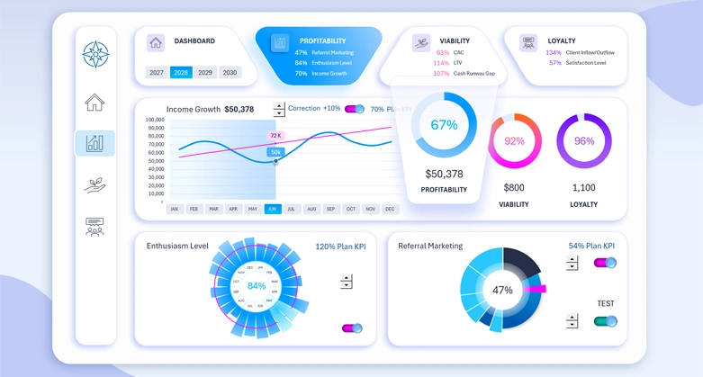
Managing KPI Plan Execution for Revenue Growth
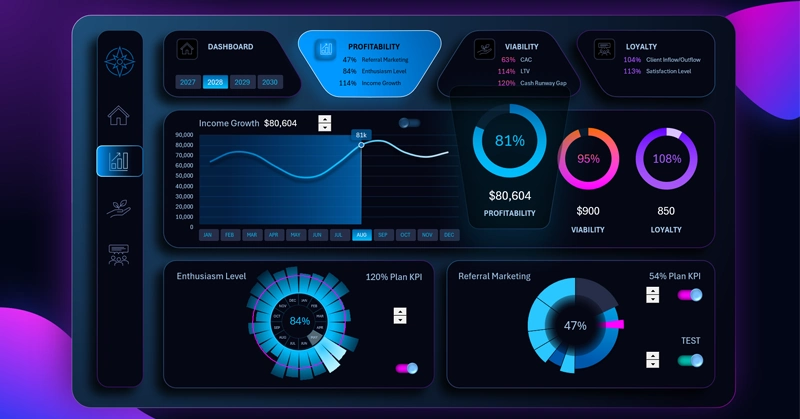
An entire dashboard screen is dedicated to project profitability analysis. The summary chart in the foreground on the right displays the average annual KPI plan completion rate across all plans and all indicators presented on this dashboard.
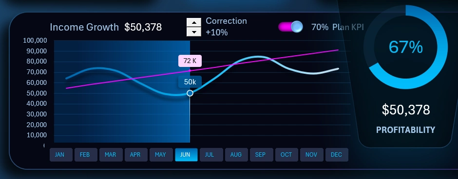
The combined line chart presents the primary indicator — monthly revenue growth throughout the entire year. The blue histogram spanning the full background width of the chart divides the year into before and after periods. This helps direct the user’s attention in a way that improves correlation analysis and helps identify cause-and-effect relationships in comparative data analysis.
The smooth blue curve represents the actual revenue values. The red diagonal line represents the target level required to achieve 100% KPI plan completion in each month. As shown in the image, according to the plan, the goal is aimed toward stable moderate growth.
This data visualization block uses 3 interactive control elements:
- Control for adjusting the diagonal target line to model different scenarios and select or optimize strategies. This is a standard spinner control — a Form Control element in Excel. In its settings, it references ordinary worksheet cells to modify their values under user control — making it highly convenient.
- A toggle switch button for enabling/disabling visual information about plan performance indicators. It helps hide the red diagonal target line for cleaner visual perception of the data when necessary. The button implementation was built using a clustered bar chart for animation, vector shapes for design, and a checkbox Form Control for user interactivity. By combining all these standard Excel tools into one object like a construction kit, users gain the ability to create their own custom dashboard controls with unique designs.
- A button block replacing the labels on the X-axis of the line chart. The primary purpose of this control element is selecting data by months, as well as by other reporting periods: quarter, half-year, sales season period, etc. The authority of this control block extends across the entire dashboard and all its screens. This means all dashboard charts respond to this control element. They display indicator values for the month selected using this button block, or aggregated totals for a group of months. The button block is implemented using Pivot Table slicers. In practice, we are controlling the Pivot Tables on which all charts are built — this is the core principle behind the main interactive mechanics of the dashboard.
The first card in the dashboard header contains a second Pivot Table slicer for switching chart values by years:

The principle of use and operation is similar. It is possible to make multi-selections of data simultaneously across several years and observe summarized aggregated values on all dashboard charts for the selected period. Even for all 4 years combined.
Employee Enthusiasm Level Analysis
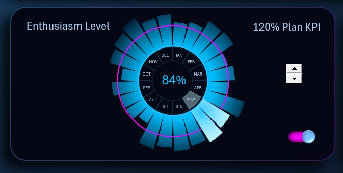
The radial chart in Excel clearly shows in which month the KPI plan for employee satisfaction was achieved. This report is based on surveys conducted by HR specialists. The test results are then calculated, coefficients are obtained, and an average percentage value is generated.
The visualization block allows adjustment of the target level using an interactive spinner control element. It is also possible to completely hide the target from view using a custom toggle switch.
Profit Growth Through Customer Network Expansion
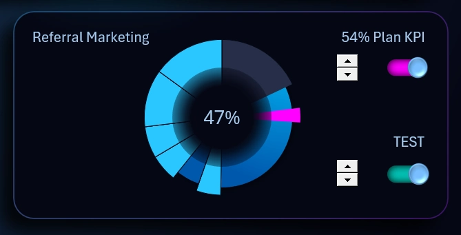
Referral marketing is a leverage mechanism for efficiency. Referral reward programs for attracting customers always pay off. Every business needs sales, and the source of sales is the customer. Everyone works for the customer, including employers. Why is referral marketing considered leverage? With every new participant, the sales network becomes stronger. Operational activities scale very poorly under autonomous conditions, but as the network grows, every operation increases proportionally. As a result, all operations together create exponential performance growth with each iteration, even when the number of operations does not increase — and sometimes even decreases — while growth continues due to new customers.
That is why the loading progress chart shows continuous sector expansion with each new movement.
This block includes a test function for observing the dynamics of changes during accelerated operational iteration cycles.
It is not necessary to immediately set the target at 100%. Although there is a useful saying about changing professions: “If you do not own 100% of the market, you still have work to do.” But in reality, 100% market ownership is impossible. Therefore, the chart allows adjustment of the target to smaller shares such as 80% or 60%. Under some conditions in global markets, even 30% already represents a monopoly that opens serious opportunities for market manipulation.
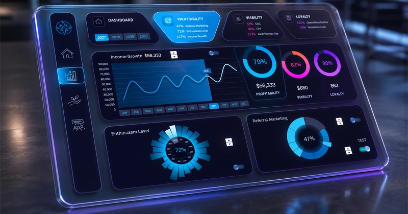
Dashboard Design for Managing Startup KPI Plans
The appearance of the dashboard template increases the enjoyment of working with data analysis. Some neumorphism techniques are applied to create a sense of mental tactility. There is also a light design version available for use during active daytime hours:
The dashboard design makes it comfortable to work with on all large-screen devices: PC, laptop, or tablet. You can further enhance the capabilities of this template:
Download KPI dashboard for startup project management in Excel 
The primary goal of a startup is survival. In the next article, we will review the second screen of the template dedicated to business survivability. Remember: resilience is more important than genius!

Data Visualization Charts for Interactive Report Creation in Excel.
Dashboard Templates