Customized Cost Distribution Chart in Excel
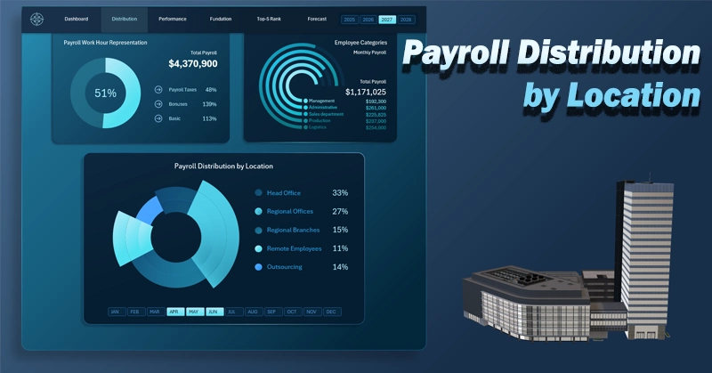
There is often a need to present segmentation metrics of similar data by categories. In Excel, it is best to use a customized chart for this purpose. Despite the fact that data visualization guidelines recommend not displaying more than two values on a single chart, sometimes it is still necessary to divide the pie into segments. For example, distributing the payroll fund by employee locations provides an additional level of understanding of a company’s cost structure.
How to customize a cost distribution chart by locations in Excel
Displaying more than two values on a single chart can visually overload the user with information. However, a customized approach to chart design allows you to overcome standard data visualization limitations on dashboards.
Suppose we need to analyze the distribution of financial resources from the payroll fund. Unlike a classic departmental analysis, this approach makes it possible to see how resources are distributed geographically and organizationally, which is especially important for companies with a distributed structure. This is also critical for analytics. What approach can an Excel dashboard developer take to solve this task?
A customized chart in Excel allows you to simultaneously display the distribution of payroll resources across:
- Head office.
- Regional offices.
- Company branches.
- Remote employees.
- Outsourcing.
All 5 metrics are displayed on a single chart. To achieve this, the visual design should be enhanced not only with a well-thought-out color palette aligned with the dashboard style, but also with distinct segment shapes. For example, alternating segment sizes:
Assume the dashboard contains multiple visualization blocks with different chart types. In that case, the customized chart template may appear smaller due to limited space. However, because its segments differ not only in color (aligned with the overall dashboard design) but also in alternating sizes, it remains visually clear even in a compact layout, as shown in the example below with a more complex dashboard:
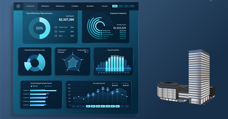
Dashboard for tracking payroll fund expenses in Excel
Analyzing payroll distribution by location helps identify hidden patterns in resource allocation and improves cost transparency. Understanding the differences between geographical and functional company structures enables more precise budget management and cost optimization. This approach strengthens control and makes financial analytics more practical and insightful.
 Download the customized distribution chart in Excel
Data Visualization Charts for Interactive Report Creation in Excel.
Dashboard Templates