Big Dashboard for Payroll Fund Management in Excel
An Excel dashboard template for tracking and analyzing the effectiveness of employee payroll expenses. The payroll fund is the largest expense category in every company. Data visualization allows you to present the correlation between payroll expenses and the dynamics of their impact on positive results. This example demonstrates how Excel can provide more capabilities for accountants, managers, or HR specialists through its data visualization tools.
Business Dashboard Design Style for Payroll Fund Management
At the core of employee motivation, fair financial compensation always comes first. A high salary and bonuses are often strong drivers of career growth. The majority of millionaires are employees rather than private business owners. Why does salary have such a strong impact on employee motivation?
There is a controversial statement that in the modern world there is no freedom other than financial freedom. If this were 100% true, the wealthiest people would be the most free, but in practice this is far from the case. They must remain fully involved in managing and controlling their capital.
However, it cannot be denied that in the hierarchy of freedoms, financial freedom is the foundation upon which it is much easier to build all others. It removes the “noise” of survival, allowing individuals to focus on higher-level goals. That is why it is so important to effectively manage the payroll fund while maintaining a balance between employee salary satisfaction and the efficiency of their performance results.
Excel is the most popular application for office professionals! It is important to use not only pivot tables in your toolkit but also interactive data visualization based on them. This provides a powerful tool for analyzing the impact of payroll on key performance indicators (KPI) of a company.
An Excel template can be used as a prototype where all the advantages of an interactive dashboard for financial reporting and management become evident.
What should such a visual report include? Let’s examine the dashboard structure by reviewing each data visualization block separately.
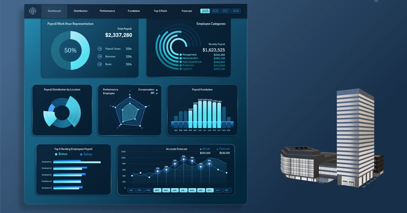
Main Menu and Summary Information on the Dashboard
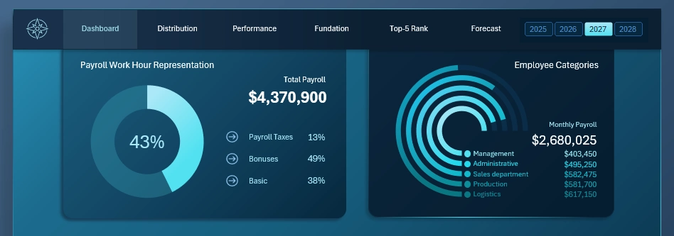
At the top of the dashboard is the main navigation menu for switching between dashboard screens to perform detailed analysis of each metric. The header also includes a set of buttons for switching between historical financial data by year.
Below are two blocks of summarized payroll expense information:
- On the left side — the total annual payroll expense in both absolute and relative terms.
- On the right side — the company’s expenses for the current month, segmented in detail by departments.
This summary information is duplicated on each screen to maintain focus on the current expense volume and continuously relate it to current KPI totals.
Payroll Distribution by Location
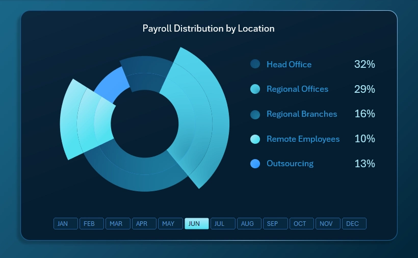
The structure of payroll fund distribution by employee location within the company:
- Head office
- Regional offices
- Regional branches
- Remote employees
- Outsourcing
It is useful for every manager to understand how investment capital is distributed not only across departments but also across offices, which are often not the same. A single department may operate across multiple offices, just as one office may serve multiple departments within the company.
Correlation Between Financial Compensation and KPI by Employee Categories
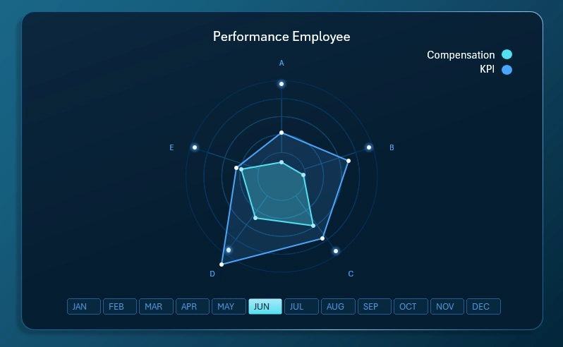
This visualization block clearly tracks the relationship between levels of financial compensation and KPI performance indicators across different employee categories (A, B, C, D, E). These categories may represent departments, offices, or custom-defined groupings based on specific business conditions.
As shown in the radar chart, compensation levels do not always correlate with KPI performance. Naturally, this is influenced by behavioral factors and working conditions. Responsible managers should investigate the causes of such discrepancies. There may be unresolved fairness issues within the team. When supporting management decisions, it is also important to consider objective external factors affecting the current situation.
Payroll Fund Accumulation
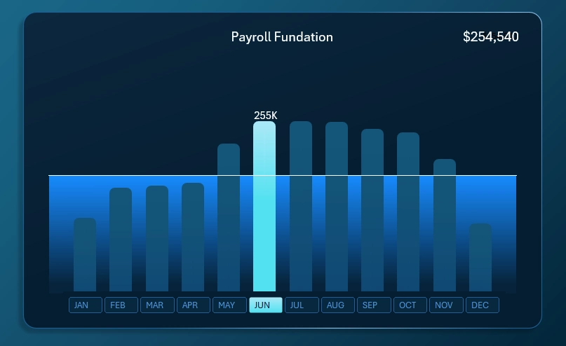
Everything here is straightforward. Each bar represents the monthly level of financial inflows allocated to the payroll fund. The horizontal line represents the monthly plan that all responsible teams in the company are expected to meet, from the sales department to the central management department.
The highlighted bar represents the cursor indicating the selected month for analysis on the dashboard. Multiple months can be selected simultaneously, which will highlight several bars. For example, when analyzing quarterly data (selecting three months at once).
The X-axis labels are interactive buttons for switching between months. These interactive labels are implemented using pivot table slicers in Excel, making them highly intuitive and convenient to use.
Top-5 Sales Employees by Salary Level
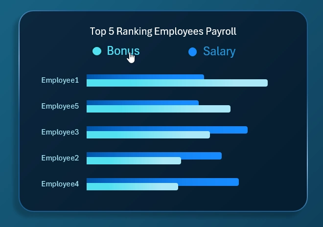
Analysis of employee rankings based on the volume of financial compensation paid in the form of monthly salary and bonuses. An interactive horizontal bar chart with descending sort functionality allows sorting by two quantitative metrics.
As a result, the visualization clearly shows which employees earn more in bonuses relative to the ranking of top performers by fixed salary payments. As seen in the chart, these are often different individuals. This allows drawing meaningful conclusions for future compensation strategy.
Compensation Forecasting
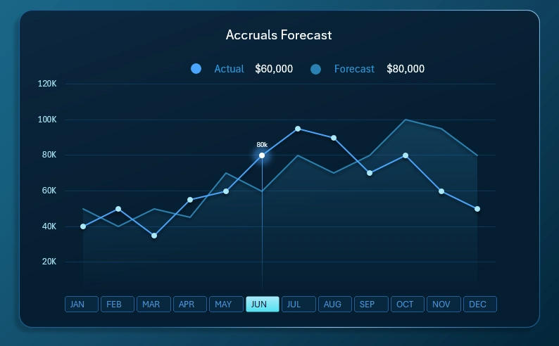
This block of line charts with markers and fill areas provides a clear view of the potential financial growth of employees’ income through salary as the company grows. Naturally, seasonality factors must be taken into account, as they directly affect the ability to earn bonuses or incentive payments.
Forecasts do not always come true, just like sales plans. However, we remember that a plan itself is nothing, but planning is everything.
Expanding Data Visualization Capabilities in Excel
The capabilities of the Excel dashboard template can be extended by adding new visualization blocks to optimize it for specific conditions and reporting requirements. To save you time, we offer a ready-made template with a business-style design for download:

Download the payroll management dashboard in Excel 
Now you only need to input your source data and refresh the pivot tables by pressing the Alt + F5 hotkey combination. Add your own unique data visualization solutions as new dashboard screens. Do not rush to build the entire report from scratch. First, review the ready-made example for prototyping and free use.

Data Visualization Charts for Interactive Report Creation in Excel.
Dashboard Templates