Dashboard for comparative sales analysis by year in Excel
Comparing monthly metrics across different years helps identify trends faster and make informed decisions. Comparative analysis shows how much current results are ahead of or behind past periods. Excel makes this visual with an interactive dashboard that combines key metrics in one view.
Example of a dashboard for comparing sales metrics in Excel
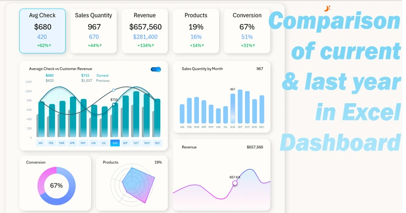
Charts in Excel have specific settings for overlaying data so that you can conveniently compare them in a single template. Based on this principle, a complete dashboard was built where you can consistently compare various key metrics for the current and previous year. The dashboard includes interactive features to highlight selected important periods of change on the chart. You can download the ready-made template at the end of the article and adapt it to your needs.
You can learn to create such dashboards for comparative analysis yourself. This video tutorial will help you a lot, showing:
- Designing the grid layout for placing dashboard visualization blocks.
- Creating the first table for interactive visualization of current and previous data in a comparative analysis.
- Organizing source data into Excel tables and pivot tables.
- Dynamic formulas to extract source values from pivot tables on the fly.
- A combined bar chart template for comparing current metrics with the previous period in Excel.
- Adding dashboard controls and styling them to match the interface.
- Developing a custom switch to compare current data with the previous period.
- A visualization block for product sales quantity metrics.
- A visualization block for monthly revenue trend changes.
- Resource allocation across product categories considering imbalance.
- A visualization block for lead-to-sale conversion.
- Creating dynamic labels for KPI cards in the dashboard header.
- A comparative analysis screen for sales volume vs. the previous year.
- Functional design for comparing monthly revenue for the current and previous year.
- A screen to analyze imbalance in resource allocation for main product categories.
- A chart for comparing conversion rates in the current and previous reporting period.
- Interactive navigation across a multi-screen dashboard in Excel — without using VBA macros.
- Presentation of dashboard capabilities for comparing current vs. previous sales metrics.
Full description of each chart’s purpose on the dashboard:
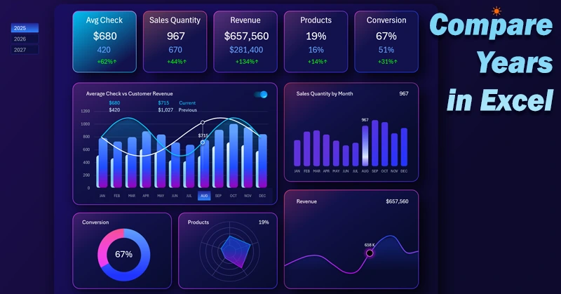
How to compare monthly sales metrics by year in an Excel dashboard.
Using an interactive dashboard in Excel, you can easily analyze and compare metrics by year without extra tables or manual calculations. This approach saves time and lets you focus on conclusions rather than data preparation.
Download Dashboard for comparative sales analysis by year in Excel

Data Visualization Charts for Interactive Report Creation in Excel.
Dashboard Templates