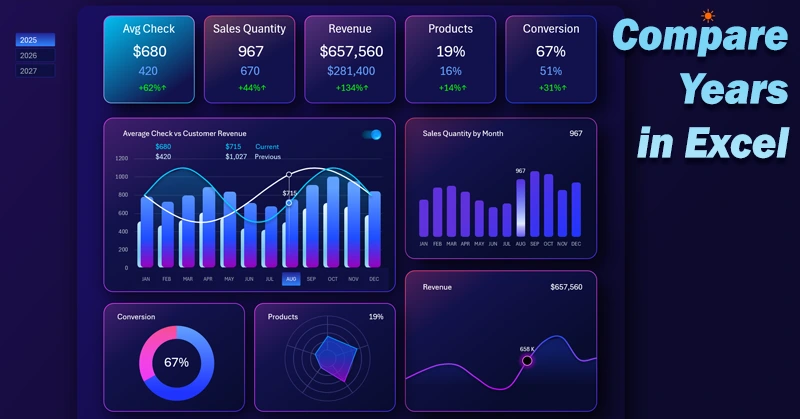
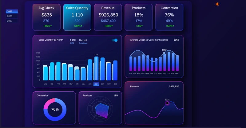
Excel dashboard for comparing monthly metrics by year
The dashboard is designed to compare current monthly metrics with last year's results for revenue, number of sales, average check, conversion, and more. Excel provides several useful visualization settings specifically for conveniently comparing two similar values simultaneously in one chart. Let me demonstrate this in practice using an interactive example of the dashboard template. You can download the Excel template file at the end of the article.
Comparison of current and last year’s metrics in one Excel chart
I disagree with Socrates only in that: “In a debate, truth is born.” In any debate, the smarter person is always wrong. But truth is revealed through comparison! Any goal should be measurable, and any measurement should have a benchmark for an adequate evaluation of the metric.
For analytics, it is very important to compare metrics with previous reporting periods to determine:
- a) progress;
- b) trends and tendencies;
- c) achievements;
- d) dynamics;
- e) forecasts, etc.
Let’s model a situation. There is a set of important key performance indicators for business efficiency, and they need to be compared with last year’s results. This will help understand the effectiveness of all implemented measures, identify points of focus for growth, and remove bottlenecks that hinder business development. In addition, such a dashboard is very useful for developing a strategy to set fair KPI targets, as well as for forecasting future achievements.
The dashboard should be able to compare the following monthly metrics for the current and previous year:
- Average check in relation to the total monthly revenue from a client.
- Monthly sales volume.
- Monthly revenue.
- Sales distribution by basic product categories.
- Order-to-sale conversion rate.
To implement the comparison for the current and previous period, the dashboard will dedicate a separate screen to each comparative analysis with main and supporting visualization blocks.
The main visualization block will include all interactive functions:
- enable and disable comparison mode;
- multi-selection of data for different reporting periods: month, quarter, half-year, etc.
- switch between years.
It is important to note that the report template allows you to analyze not just two years, but each subsequent year compared to the previous one. That’s why the example provides data for 3 years, but in fact for 4—because each year has data for the previous year. In any case, it is more than just 2 years. If desired, you can expand the dataset for any number of years.
This approach makes the dashboard expressive in its logic and highlights it against competitors’ interactive Excel reports. Next, we will examine all screens and visualization blocks in detail.
Summary information in the dashboard header
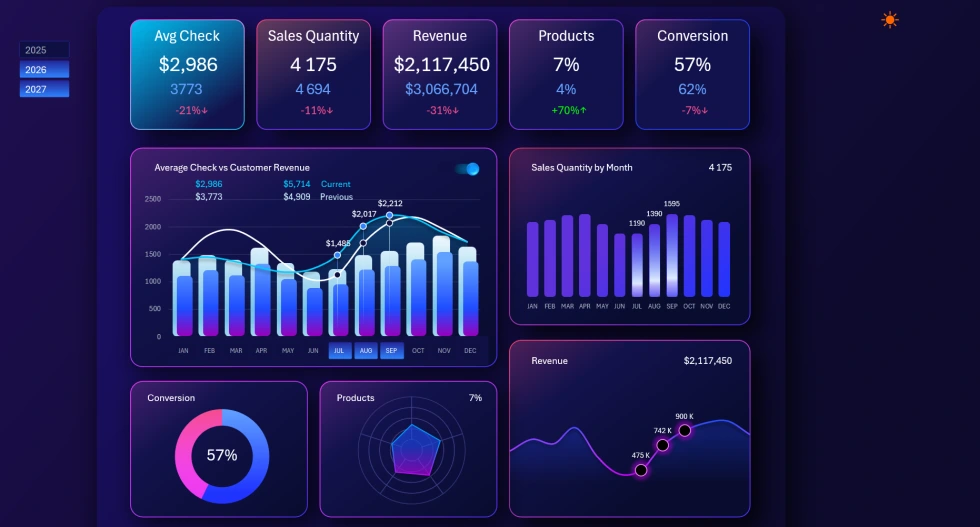
At the very top of each dashboard screen, there is a header of KPI cards that function as menu buttons for switching between screens:
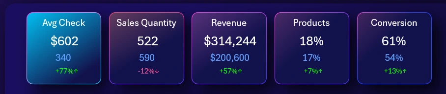
The logic of the card label structure is simple. First comes the short name of the report selected for comparative analysis. Below is the current metric, and further down is the value for the previous year.
The last label at the very bottom of each KPI card is the percentage change of the current metric compared to the previous one. The difference can be either positive or negative depending on the results. If the difference is positive, the label color is green with an upward arrow at the end, and if negative – the color is red with a downward arrow. This way, the direction of the trend change is displayed at a glance.
Two combined charts for data comparison
To the left of the dashboard header, there are buttons for switching between years (as shown in the first image in this article).
The main visualization block acts as the stage for the key event sources on the dashboard:
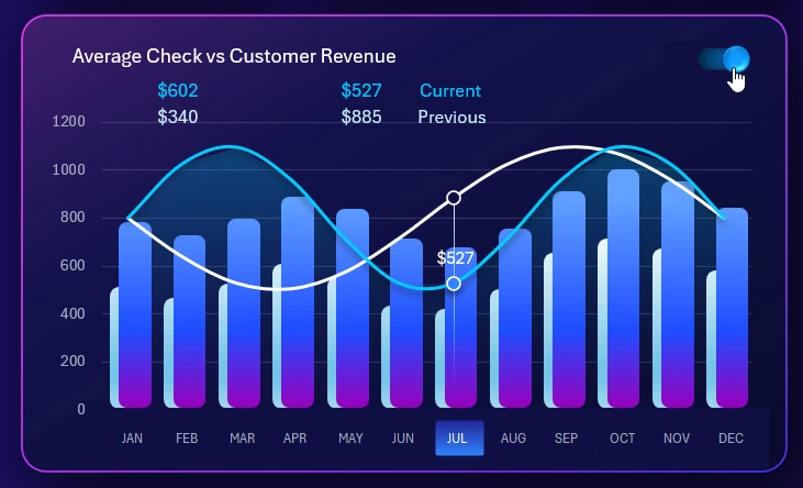
Here we analyze the history of the struggle for progress in various business battlefields. Each screen presents its metric in the main data visualization block.
Here we control the data selection for detailed analysis and switch between years. We enable or disable comparison mode with the previous year’s metrics.
In this case, the image compares the average check to the total monthly revenue from an average customer. For the selection display, you can choose multiple months simultaneously to analyze a quarter, sales off-season, or other reporting periods.
Interconnected data visualization blocks
On the right is an auxiliary block for analyzing sales volume in units:
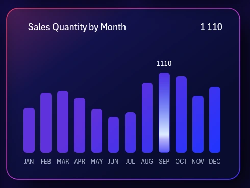
Auxiliary blocks can also be used to switch between dashboard screens. If you click any of them, the chart from the selected auxiliary block will move to the main block, and the chart that was in the main block will automatically take its place.
For example, if we want to analyze sales volume in units in detail compared to the previous year, we need to move this chart to the main visualization block. We click on it, and the screen automatically switches, dedicating the dashboard to the quantitative analysis of product sales.
All auxiliary blocks can open their respective screens.
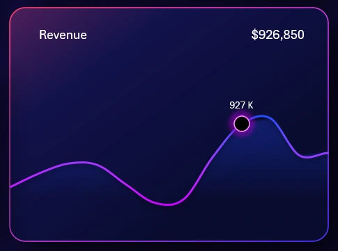
Monthly revenue for the current year:
Distribution by product categories with imbalance indicators:

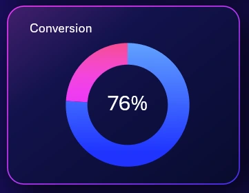
Lead-to-sale conversion rate:
Each metric can be compared with the same metric from the previous year for the same selected reporting period.
Overview of all Excel dashboard reports
Screen for comparative analysis of sales volume:
As described above, when switching to a new screen, the average check chart from the main block now takes the place of the selected sales volume analysis chart. All other auxiliary interconnected blocks help to see the bigger picture for better detection of valuable patterns. In business, as in a game, to win – you need to identify the best patterns and master the skills to use them effectively.
Revenue comparison analysis
Screen for comparing monthly revenue dynamics between the current and previous year:
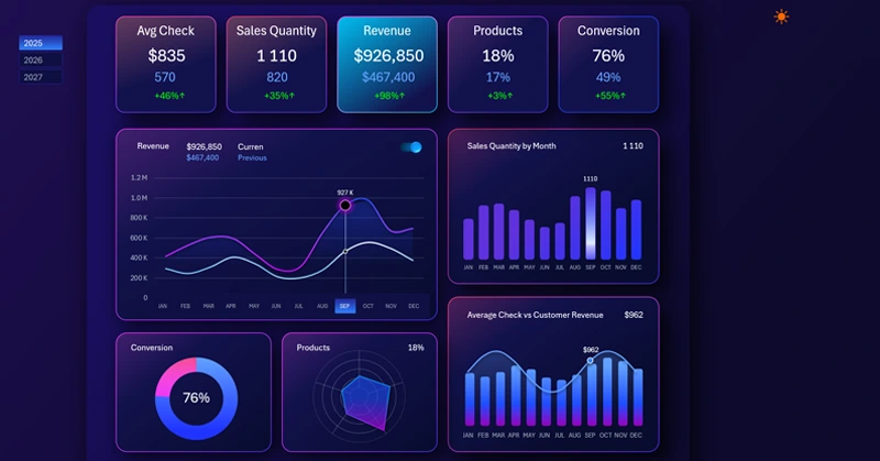
Everything here is simple and concise. The visualization is intuitive and offers no obstacles to entering the workflow. The infographic speaks for itself. It is very easy to work with this screen.
Sales distribution by product categories
A radar chart provides an impressive view with various categories displayed in a single visualization block:
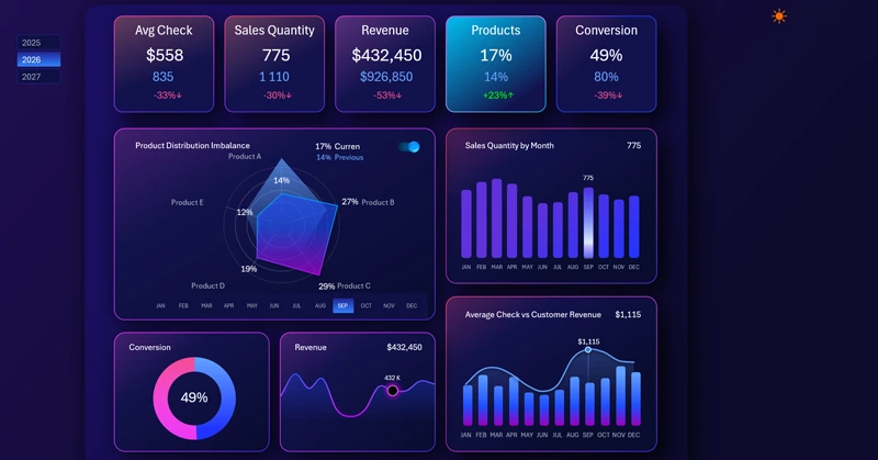
Moreover, their number can be doubled by enabling the previous year’s display mode, without affecting visual readability. In the example shown: the foreground is the current year, the background is the same month (September) from the previous year.
Sales conversion comparison analysis
This is what the comparison of the lead-to-sale conversion rate for the current and previous year looks like:
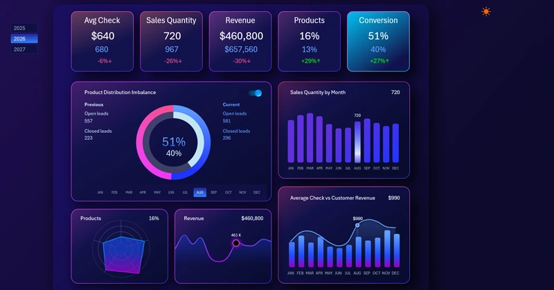
The outer ring represents the current year: the blue segment shows the percentage of closed deals, and the red segment shows the percentage of unclosed leads.
The inner ring represents last year’s conversion metrics, respectively.
Advantages of the Excel comparative analysis dashboard
Let’s summarize the main value of the dashboard – it allows you to compare last year’s metrics with current values. Moreover, you can compare multiple years at the same time. We can make the task more complex by selecting all years at once or selecting several years simultaneously, as shown in the image below:
Download the Excel year-over-year comparative analysis dashboard 
As a result, the dashboard will handle it without any problems. While it’s rare to need this, having such a feature is always useful in business analytics.
Helpful tip! Although truth is revealed through comparison, never compare your business to competitors, only to your own past performance. If there is growth, even if slower than competitors, your business is doing well. On the other hand, even if you are a market leader with better results than competitors, but worse than your own performance last year – this is a clear cause for concern. For example, the market might be shrinking and soon become irrelevant or unprofitable.
The dashboard for comparing current metrics with last year’s will always help you – and most importantly, in time.

Data Visualization Charts for Interactive Report Creation in Excel.
Dashboard Templates