Dynamic Excel Bar Chart of Payroll Fund Contributions
The payroll fund receives contributions every month, but it's rare for anyone to track those inflows as a trend. One month above plan, the next below: without visualization, these fluctuations stay buried in a spreadsheet instead of making it into management's focus. The interactive data visualization block in Excel addresses exactly this with a combined bar chart. A bar chart with a cursor and a horizontal annual average plan line instantly shows which months are falling short of the benchmark. The cursor is used to highlight the selected period. The visualization lets you get a cumulative total for any reporting period — month, quarter, or year — in a single click, with no manual calculations or pivot tables required.
Interactive Bar Chart Template with Rounded Bars in Excel
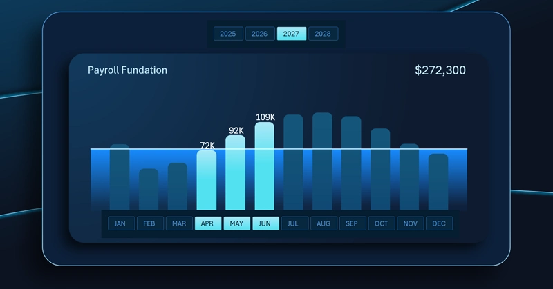
The vertical bar chart in Excel for analyzing payroll fund contributions looks like this:
- Each bar represents the volume of monthly contributions to the payroll fund.
- The horizontal line is the annual average plan benchmark.
- The three highlighted bars of the second quarter represent the active selected period for segmented analysis with automatic calculation of the Q2 cumulative total.
The annual average plan line and the period-selection cursor for instant quarterly total calculation help users work comfortably and efficiently in Excel — no tables or formulas needed.
Recommended reading on the topic — how to use a dynamic bar chart on an interactive Excel dashboard:

Excel Dashboard for Payroll Fund Management in Teal Organizations
The interactive bar chart may look like the simplest element on the dashboard — and that's exactly why it's one of the most effective from a data visualization readability standpoint. The annual average plan line sets a single reference point for all months, while the period cursor eliminates the need to add up numbers manually during quarterly or semi-annual analysis. The simplicity here is intentional: the less effort it takes to read a chart, the more often people refer to it — which means deviations get spotted sooner and decisions get made faster. Compact blocks like this are what keep the entire dashboard sharp and actionable.
 Download the Dynamic Payroll Fund Contributions Bar Chart in Excel

Data Visualization Charts for Interactive Report Creation in Excel.
Dashboard Templates