Excel Equipment Energy Consumption Ranking Charts
Reducing energy costs at a bakery is impossible without understanding one simple thing: which specific piece of equipment consumes the most. Intuition doesn't work here — a tunnel oven and a proofing cabinet may look equally "heavy" on the overall electricity bill, but a detailed breakdown tells a completely different story. The equipment ranking block on an Excel dashboard delivers that detailed breakdown instantly — and immediately shows what the current production volume costs in CO2 emissions.
Mini-Dashboard for Tracking Equipment Energy Consumption Trends
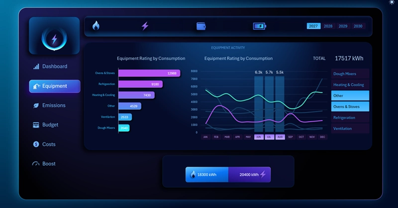
Equipment ranking block: a horizontal bar chart with auto-sorting by total gas and electricity consumption in descending order (left), and a speedometer gauge showing actual CO2 emissions against a 5,000 kg per month benchmark (right); when the energy source is switched, both elements recalculate automatically.
Find out why electrical equipment also affects CO2 output: the biological emissions of yeast dough and the role of the emergency generator in a bakery's environmental balance — all covered in the dashboard usage guide:
Energy Dashboard for a Bakery in Excel
The equipment ranking and the CO2 indicator are two dimensions of the same problem: how many resources production consumes and what environmental footprint it leaves. The auto-sorting ranking that updates when switching between gas and electricity lets you quickly shift your angle of analysis without manually rebuilding the report. And the ability to set a custom emissions limit on the DATA sheet makes the dashboard applicable to any bakery — regardless of regional environmental regulations or internal company policy. Two charts, one block — and you already know where to look for cost-reduction opportunities and where to keep an eye on the production's environmental balance.
 Download Excel Equipment Ranking Charts in Excel
Data Visualization Charts for Interactive Report Creation in Excel.
Dashboard Templates