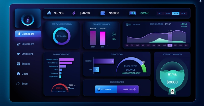
Excel Energy Dashboard for Bakery Project Management
The Excel energy dashboard template gives you greater control over managing your business financial performance. This example presents a model for analyzing gas and electricity expenses for bakeries. The multi-level Excel dashboard can segment all indicators by the two main energy sources at the highest reporting level. This makes it possible to separate data across all nested segmentation levels: by production equipment, additional investment sources, and budgeting categories.
How an Excel Dashboard Helps Increase Bakery Profits by +100%
Everyone wants business results, but only successful businesses need systems that generate results! A well-designed system allows you to manage results and make them more predictable. Everything that can be measured can be managed. Thanks to this principle, the dashboard helps manage the business and its outcomes. The dashboard provides measurements of key indicators in a way that immediately helps us find solutions for influencing the desired result.
In this example, the interactive Excel dashboard allows users to manage the energy costs of a bakery business. Gas and electricity are the main expense categories for a bakery.
The dashboard structure is originally designed so that indicators can be separated at any time by two energy sources: gas and electricity. This allows users to find cause-and-effect relationships influencing the results faster and more effectively.
How important is it to control and manage bakery expenses? The production of baked goods is focused on the mass market, which means profit margins are relatively low — around 20%. Revenue is driven by high demand volume. Therefore, reducing expenses by 25% can increase bakery profits by +100% — in other words, DOUBLE THEM!
The Profit Doubling Formula
Here is a sample formula for verifying calculations related to doubling profits through expense reduction.
Let’s break everything down step by step without unnecessary confusion. Here is how the process of doubling business profits works with a 20% profit margin:
- Starting point: You sell a product for $100. Your net profit is $20 (which equals a 20% margin). This means production costs are $80.
- Reducing expenses: You reduce these expenses ($80) by 25% (minus $20). Now production costs only $60.
- Result: You still sell the same product for $100, but now spend only $60 on production. Your new profit is $40.
Bottom line: Profit increased from $20 to $40 — which is exactly a 100% increase (it doubled).
To reduce expenses, you first need to analyze the production system and the business as a whole. Start by focusing on the main expense categories. It is very difficult to significantly reduce labor costs. Modern energy-efficient systems, however, can make a substantial impact on the energy expenses of a manufacturing business. Moreover, these systems can automatically collect statistics from all nodes of the production chain for further data visualization.
Purpose of Energy Consumption Visualization Charts in the Bakery Dashboard
We already understand the main purpose of the Excel dashboard template. Now we can dive deeper into the details and review the intended purpose of each data visualization block in this bakery business analysis model.
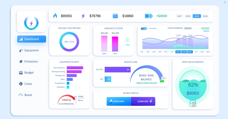
What Do We Consume More: Gas or Electricity in the Bakery?
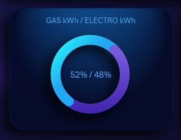
The first summary chart is designed to monitor total energy consumption across two sources: gas and electricity. When one of the sources is disabled on the dashboard for comparative analysis, the chart still preserves the actual share of the analyzed energy type. In other words, it does not reset the value to 100% or 0%, so the analytical balance remains intact and this important indicator always stays visible.
Comparing Financial Expenses With the Previous Period
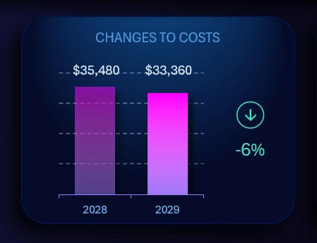
Total financial energy expenses for the bakery are compared with the previous year. If one of the energy sources is disabled, the chart automatically recalculates all indicators accordingly.
If the expense amount in the current year is lower than in the previous year, this is considered a positive result. In this case, the arrow indicator displaying the percentage difference shows a minus sign and is highlighted in green. Otherwise, the percentage value will display a plus sign and be highlighted in red because expenses increased, which represents a negative business scenario.
Multifunctional Combined Chart
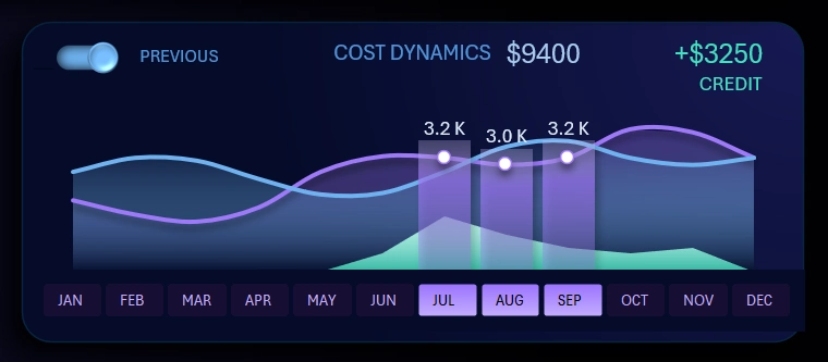
For a more detailed analysis of changes in the dynamics of monthly energy expenses throughout the year, a line chart is used.
Several interactive features are available here at once:
- Enable / disable the trend change line for the previous reporting period. In the upper-left corner there is a toggle switch for comparative analysis mode against the previous year.
- Planning the use of additional financial resources during difficult sales periods of the year. For example, using credit funds during seasonal sales declines. Or, conversely, using borrowed funds for an additional sales boost during periods of peak customer activity. Everything depends on the strategy and capabilities of the business model.
- Interactive X-axis. Instead of labels, buttons are used to control cursors and reporting period selections through month ranges. For example, the image shows data selected for the third quarter. All monthly values are summed directly on the chart.
This interactive line chart works according to this principle. However, you can expand its capabilities directly on the dashboard. Simply use the main menu.
Detailed Expense Dynamics Analysis for Comfortable Work
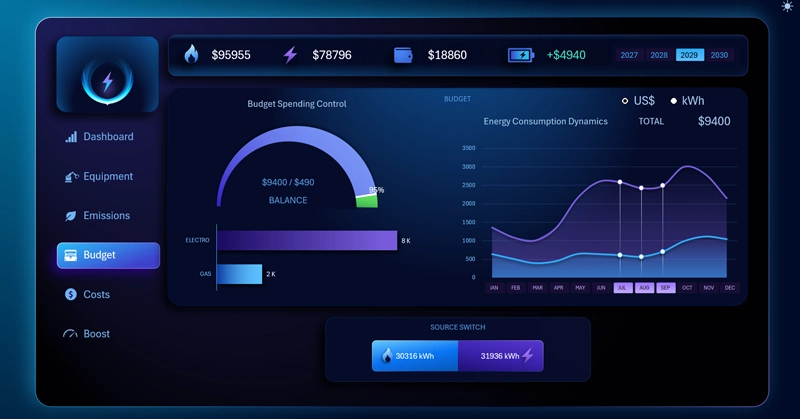
To fully immerse yourself in the analysis of monthly expense dynamics comparison using this tool, use the dashboard main menu by selecting the “Costs” option:
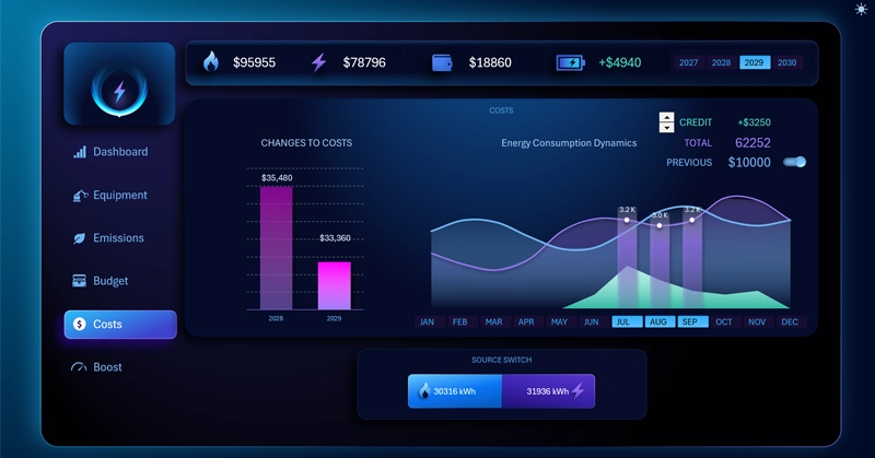
The pivot table slicer allows us to select multiple months simultaneously. This makes it possible to analyze not only quarters, but also half-years, full years, sales seasons, and more. The authority of this button block extends across the entire dashboard and all of its child screens.
Above this visualization block is the dashboard header:

On the right side there is another pivot table slicer button block for switching between years. It also allows users to select data for multiple years at once or for all 4 years simultaneously.
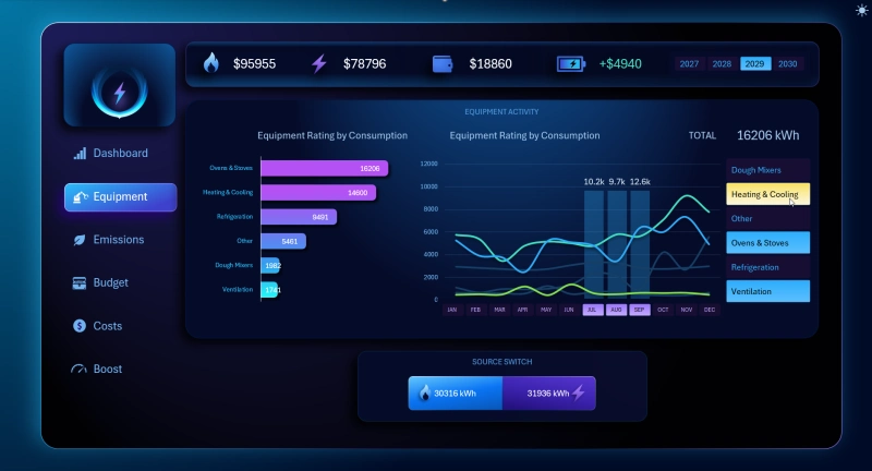
Equipment Energy Consumption Ranking
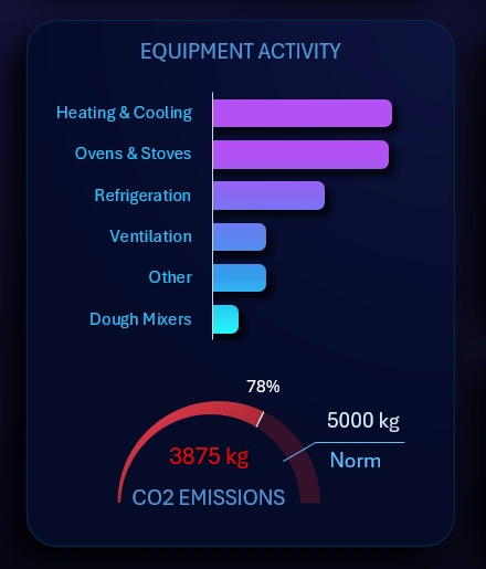
This block contains two visualizations of interconnected data:
- An automatically sorted equipment ranking by descending energy consumption volume. When one of the energy sources (gas or electricity) is disabled on the dashboard, the ranking is automatically resorted. Some equipment types use both energy sources — this factor is also taken into account in the report presentation.
- A gauge indicator for monitoring CO2 emission limits. The image shows emission values and limits for one month. If multiple months are selected, both the emission values and the limit values are recalculated automatically and accordingly. In the dashboard source data, the CO2 emission limit is set at 5,000 kg per month. If necessary, the user can specify their own standards on the “DATA” sheet containing the smart table for entering source data in Excel.
To segment energy consumption data by equipment across all energy types, switch to the “Equipment” dashboard section:
Dynamic Analysis of Monthly CO2 Emissions in the Bakery
Electrical equipment can also significantly affect CO2 emission levels, but not due to fuel combustion. Instead, this happens because of two other processes:
- Biological emissions inside the oven when yeast dough is heated above +50 degrees Celsius.
- Indirect emissions when electricity is supplied by a diesel backup generator. With other power sources such as transformers, wind turbines, or solar panels, indirect CO2 emissions are practically zero.
To track changes in monthly CO2 emission dynamics, switch to the “Emissions” dashboard screen:
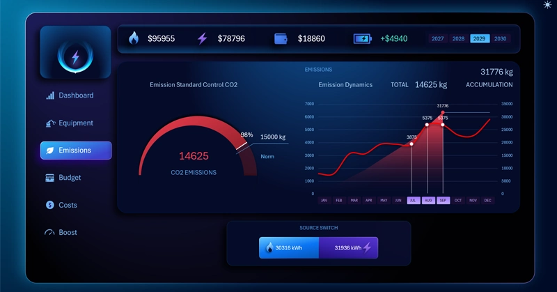
If gas expense data is excluded from the report, the CO2 emission control indicator will decrease sharply, but it will not reach zero due to the reasons described above.
Visualization Block for Budget Expense Control
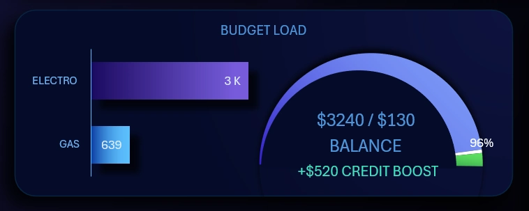
This visualization block also includes two interconnected charts:
- Comparison of the cost of the required energy volume by different sources. If the summary chart shows nearly equal distribution shares of gas and electricity consumption in kilowatt-hours, the difference in monetary value is still substantial. The cost of one kilowatt of gas is significantly lower than the cost of one kilowatt of electricity. If your region has different utility rates, they should be specified on the “DATA” sheet where all source values are stored.
- The budget consumption scale is presented in the form of a speedometer chart. Data labels display the absolute values of spending and the remaining balance of budget funds in the account. It also shows the amount of borrowed funds used to maintain balance during a particular month.
An entire dashboard screen is dedicated to this visualization block for detailed analysis and expense tracking in dynamics.
Budget Balance of Energy Expenses in USD and kWh
When any energy source is disabled, the budget indicators change automatically and accordingly. Unlike the first summary chart, if gas is disabled, the gas histogram scale drops to zero. The same applies to electricity expense indicators — if electricity is excluded from the report, the budget information will show $0 for electricity costs.
Custom Animated Progress Chart in Excel
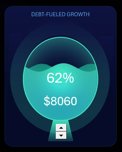
Standard Excel capabilities allow users to create custom charts for solving various non-standard tasks. For example, this progress chart tracks the use of available credit resources to support the business during the worst and/or best periods of the year. In other words, when there is a need or opportunity to increase revenue volume due to market conditions or seasonal sales activity changes.
For a more detailed analysis, use the “BOOST” option from the dashboard main menu.
Covering Budget Overspending With Credit
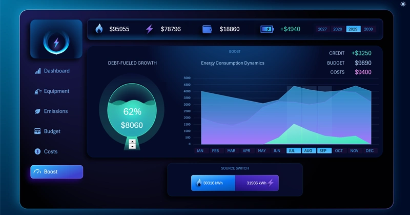
How to use it: select a year and month. Then use the spin button form controls. As a result, the light-green curve on the line chart will begin to change. Depending on the percentage of credit resources (or reserve funds) used, the light-green curve on the chart will change accordingly, and the budget indicator will be replenished with new values.
It is possible to implement such interactive mechanics for data visualization in Excel using formulas alone thanks to dynamic named ranges with formulas.
Pleasant Dashboard Design for Comfortable Work
This energy dashboard template includes a light design version for working during daytime hours under bright office lighting:
All data visualization blocks are highly important. Major charts have dedicated screens with separate mini dashboards for detailed analysis.
Excel allows users to create their own animated charts as well as custom interactive controls. For example, take a look at these large buttons for disabling energy source types with stylish design:

This button block has its own practical purpose. First, the buttons are large because users will frequently use them and they need to be easy to click. Second, they must provide enough space to display data labels with the total consumed energy values in kilowatt-hours.
Overall, the entire design is highly user-friendly and visually appealing despite the fact that the dashboard template is built in Excel. Its standard capabilities are sufficient for creating such masterpieces intended for practical business use:
Download the Excel energy dashboard for bakery project management 
You can always improve and optimize this template for your own needs. No advanced skills are required. It is enough to understand pivot tables and the basic principles of building charts based on dynamic formulas in Excel.

Data Visualization Charts for Interactive Report Creation in Excel.
Dashboard Templates