Payroll Fund Accrual Bar Chart in Excel
Payroll is one of a company's largest expense items — and at the same time one of the least transparent in day-to-day operations. The finance department sees the total at the end of the month, while sales, operations, and management keep working in the dark. The payroll accrual block on an Excel dashboard changes that logic: everyone involved can see how actual contributions to the fund align with the plan — right now, broken down by any month or quarter.
Payroll Fund Under Control with an Excel Dashboard
Payroll is always under control, because the payroll accrual bar chart in Excel reveals the gap between plan and reality before accounting even notices it.
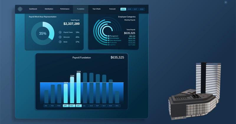
Bar chart for analyzing payroll accrual dynamics:
- Each bar represents the monthly volume of contributions to the fund.
- The horizontal plan line is the annual target benchmark for all monthly contributions.
- Each highlighted bar under the cursor marks the active analysis period, selected via interactive X-axis buttons.
How to read the chart: the highlighted bar, the plan line, and the month buttons as a unified data navigation system — described in detail here:

Dashboard for Payroll Fund Management in Excel
Visualizing payroll accrual isn't just a pretty chart — it's a tool for shared accountability. When the plan line is visible to everyone, from a sales manager to senior leadership, payroll stops being an abstract number buried in a financial report and becomes a common reference point. The interactivity of pivot table slicers lets you switch between monthly and quarterly views in seconds, without manually rebuilding the chart. Details like these are what transform an Excel dashboard from a static report into a living management tool.
 Download the Interactive Accrual Bar Chart with Plan Line in Excel

Data Visualization Charts for Interactive Report Creation in Excel.
Dashboard Templates