2 Progress Bars to Compare Budget and Timeline in Excel
For successful project management, it's important to track not only deadlines but also how effectively the budget is being spent over time. This data visualization template shows how to create two different progress bars in Excel—both in design and type—that allow you to compare these parameters. This approach helps quickly identify schedule delays or budget overruns.
Infographic of Budget and Time Progress for Excel Dashboard
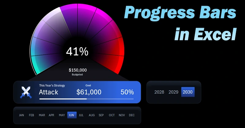
Using two performance indicators—time and budget—provides a clear view of project progress. It's important to present them visually because such critical information is read faster and more effectively. Excel chart and graph tools allow you to create interactive infographic reports. A great example is provided through this template and a tutorial video explaining how to build progress bars in Excel. To make learning easier, the video is divided into several steps:
- Create panels for the infographic and dashboard control buttons.
- Process source data using pivot tables in Excel.
- Create dynamic formulas to build interactive charts.
- Formula table for the first progress bar — budget spending.
- Progress bar styled as a speedometer chart.
- Dynamic data labels on the dashboard linked to formulas.
- Create the second progress bar — timeline progress throughout the year.
- Add a slider infographic with symbols for yearly strategy markers.
- Design slicer buttons to control the Excel dashboard.
- Showcase the practical use of both progress bars for comparative analysis of budget and time efficiency in Excel.
Example of integrating and using progress bars in an Excel dashboard:
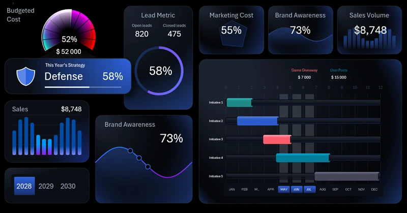
Excel Dashboard Template for Brand Marketing Strategy.
This type of visual tool with interactive features in Excel helps you make timely decisions and keep the project under control.
Download Progress Bar Templates for Budget and Timeline Comparison in Excel

Data Visualization Charts for Interactive Report Creation in Excel.
Dashboard Templates