Excel Dashboard for Visualizing Brand Marketing Strategy
A strong marketing strategy is not a luxury, but a necessity. Use an Excel dashboard to manage and strengthen key metrics of brand awareness growth strategy initiatives. You will always have a clear advantage in building long-term relationships with clients. 60% of profits come from repeat customers. According to the Content Marketing Institute Report (CMI B2B 2023), 62% of the most successful marketers have a documented marketing strategy, compared to just 16% of the least successful ones. 80% of approved investments were supported by presentations that included data visualization.
Excel capabilities for visualizing a brand marketing strategy
A marketing strategy is simpler than it seems and more powerful than you think. Why? It all comes down to two simple words. Marketing is sales. Brand is customers.
A business needs only two things — customers and sales. These are the two focus points that always drive growth in any business and under any conditions. You can’t do everything perfectly, so make sure you perfect your relationships with customers and your sales process to keep your growth momentum.
Many ask: “Does a small business really need a brand?” — that’s a strange question. Every business already has a brand. A brand is how your customers perceive you and your business. The only question is whether you’re developing that brand or not.
Excel offers broad capabilities for effectively working with a brand marketing strategy, making it an accessible tool for any business. Let’s demonstrate what Excel can do using a specific conceptual example of an interactive dashboard. Data visualization always enhances efficiency and productivity by making important information easy to digest and motivating action.
Budget and time resource spending
Marketing promotion is always a long-term strategy. And in the long run, expense control is more important than revenue growth. We always have more influence over controlling expenses than increasing income.
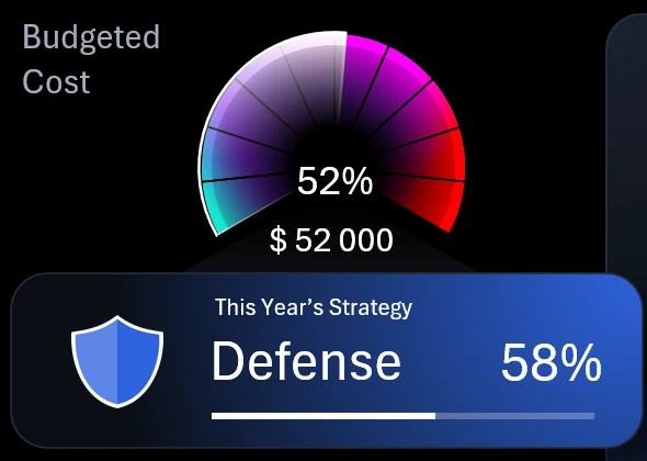
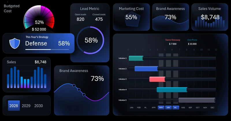
2 Progress Bars for Budget Spending Control
The most important information on a dashboard is usually placed in the upper left corner. In this template, that’s where visual data is shown for the ratio of two key expense indicators — time and money:
- Spending of the financial budget allocated to the brand awareness promotion strategy.
- The tactical phase of strategic development for marketing initiatives according to the plan, along with the time budget allocated for its execution.
As an example of effective use of this visualization block, let’s describe the current picture.
The chart shows that 52% of the marketing budget has already been used. Now, shift your attention to the progress bar below. It serves as the overall project timeline. The progress bar informs us that 58% of the strategic plan timeline has passed. This is an efficient pace of budget usage. Overall, it’s highly likely that the remaining funds will be enough to complete the current strategy phase — “Defense.” That’s a clear sign that things are going according to plan.
Above the progress bar is the phase title — Defense. In this dashboard visualization scenario, the brand awareness marketing strategy is planned over a 3-year period. Each year represents a distinct phase:
- Defense. Holding market position and increasing customer loyalty.
- Preparation. Market analysis and brand audit, identifying growth points, and setting up channels and resources before active campaigns.
- Attack. Aggressive promotion, capturing market share, launching new campaigns and products, and boosting brand awareness.
In business circles, you’ll often hear quotes from Sun Tzu’s *The Art of War*. For example: “Defense is born of insufficiency; attack is born of excess.” Another relevant quote for this dashboard: “Victorious warriors win first in planning and then go to war; defeated warriors go to war first and then seek to win.”
Now the meaning of all three phases in the marketing strategy planning and development process on the dashboard becomes clear. Each phase has its own budget of resources and time. Both are represented in this data visualization block to help monitor their expenditure ratios.
The block with the promotion phase title and time budget also functions as a button to switch from a sub-screen to the main home screen of the dashboard.
Conversion rate is a performance metric
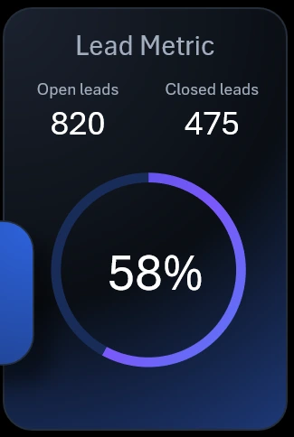
Beautiful Pie Chart Template in Excel
The adjacent visualization block is also highly important. The lead conversion rate reflects customer trust in the brand — the higher it is, the more trust buyers have. In the context of this visual report, it’s a performance metric. The ultimate goal of brand development is to build strong customer trust.
If we briefly look at the history of brand popularity, we recall that today a brand acts like a traditional shopkeeper who directly interacts with the customer. Back when shopping malls and supermarkets were not widespread, people bought goods from shopkeepers who explained each product’s strengths and weaknesses and why it was right for a particular customer. But now, in a supermarket, the customer stands alone with the product on the shelf. The brand must silently assure the customer they’re making the right choice and highlight the product’s rational advantages. This often works — because of earned trust. For customers, trust matters more than information.
A successful brand helps customers instantly make the right decisions and rational choices. This drives the lead-to-sale conversion rate.
KPI cards with summary indicators
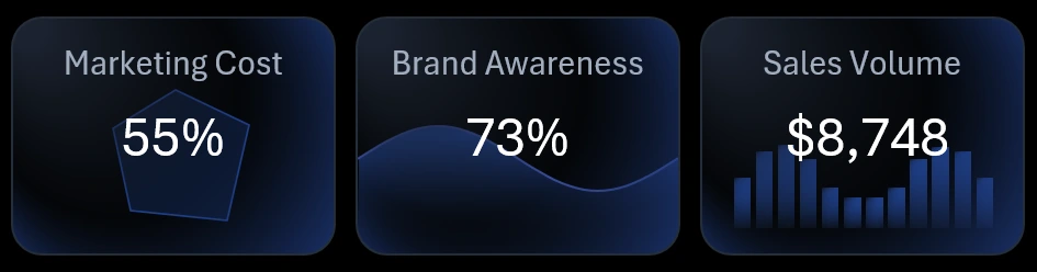
At the top of the dashboard are summary KPI cards. Each card functions as a button to switch between dashboard screens. Interestingly, the miniature visualizations on the cards are not just decorative design elements — they serve as sparklines and reflect real data. When the dashboard updates, the KPI cards also update automatically. This gives you small previews of each dashboard screen.
Marketing initiative timeline in Excel
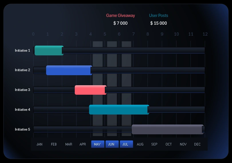
Project Management Chart in Excel
The largest visualization block shows how Excel can present a timeline of events related to marketing initiatives.
Below is a button block to switch between months on the dashboard. In the context of the timeline, it is used to control the cursor. If the cursor is within the timeframe of a marketing initiative, the name and planned budget are highlighted above. This dashboard template features 5 marketing initiatives:
- Launch of a seasonal ad campaign.
- Partnerships with influential collaborators.
- Prize giveaway game for customers.
- User-generated content featuring the products.
- Series of educational and helpful content for consumers.
The button block is created using pivot table slicers. This allows you to select multiple months at once — for example, by quarter, half-year, season, or other accounting periods.
This block changes across different dashboard screens. We’ll review each screen in sequence next.
Spending structure and corresponding results
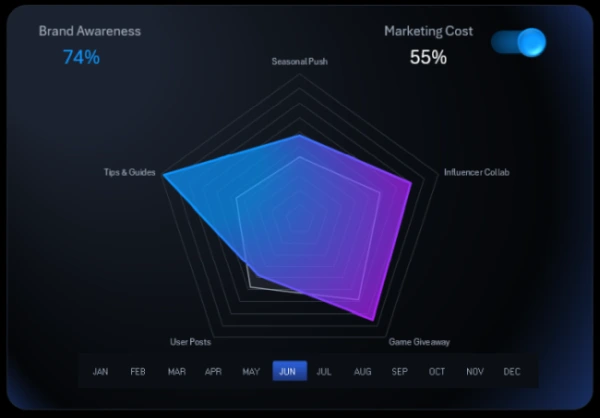
Beautiful Chart Templates for Excel
Clicking the first KPI card opens a screen showing the breakdown of spending and awareness metrics for each marketing initiative.
Radar charts are a very effective way to visualize data distribution. If the visualization feels overloaded, you can disable 50% of the metrics using a toggle in the upper right corner of the block. On the Processing sheet, you can configure formulas to determine which group of metrics is hidden with the toggle — either spending or awareness.
By turning off some data, the dashboard allows for more comfortable, readable analysis with easier interpretation of large volumes of important information. When selecting a month or year on the dashboard, the spending data updates automatically based on the selected period.
Controlling spending is always important! It’s not about cutting costs at all costs — it’s about planning budgets for resources and time. In other words, risk management. We have more influence over spending than revenue, so we carry greater responsibility here.
Business isn’t a game — but it includes many game-like elements. The principles behind games and business are very similar. It’s important to acquire more of the best resources — and even more important to learn how to use them effectively to better manage processes.
Note: The feature to hide data series on the chart using a custom UI element is implemented without macros — it uses only built-in Excel features and formulas. In the main Excel menu, under the Developer tab, you can use the "Insert" option to add form controls. For this UI tool, a checkbox was used from this group. It’s placed over a horizontal bar chart with images instead of color fills. Download the ready-made template and see for yourself how you can expand Excel’s capabilities without any programming skills.
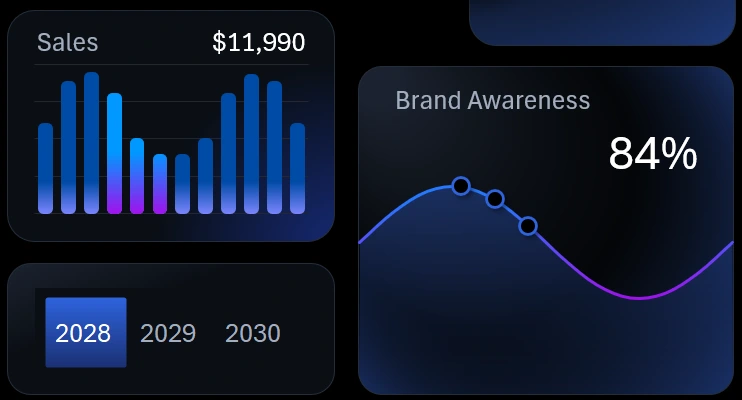
Brand awareness metric presentation on Excel chart
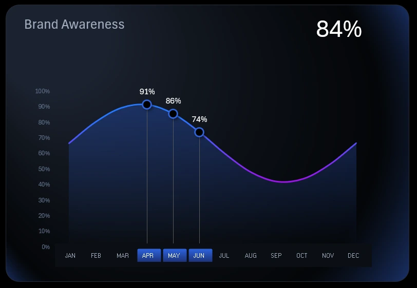
Stylish Chart Template for Dashboard
The central KPI card switches to the analysis of brand awareness dynamics. The data is presented as relative monthly values over one year.
Brand awareness is always a relatively measured factor. It is typically measured differently depending on corporate culture. Calculations usually involve formulas that return a coefficient, and the result is often quite subjective. The calculation method heavily depends on the industry and business specifics. Still, brand awareness must always be assessed, monitored, and improved.
Gathering data for brand awareness to feed into formulas is a labor-intensive process. It requires research, audience analysis, surveys, and more. The template's source data already includes calculated brand awareness coefficients as relative values.
Monthly sales volume analysis in monetary value
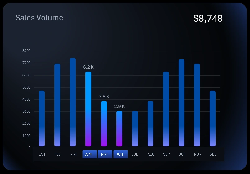
Beautiful Bar Chart Template with Rounded Corners
The final KPI card shows the ultimate goal – sales. Sales volume is influenced by many factors. It's important to regularly monitor how sales volumes correlate with marketing initiatives, brand awareness growth, and conversion rates.
Sales happen in the market – that’s the target of any marketing strategy. It's crucial to ensure that each sale generates profit because it represents the result of all efforts. That’s the essence. No matter how much you love your business, it will never be just a hobby. In business, results matter! They can't be less important than the process. In hobbies, it's the opposite – the process is more important than the result. But business without results has no meaning. There is no business without sales. Selling means helping people – and that's where brand trust is born.
Supplementary data visualization button blocks
In the bottom left corner of the dashboard, there are minimalist-style supplementary visualization blocks. They reflect real values and are designed to quickly compare and analyze correlations between related indicators on the dashboard.
Additionally, these supplementary blocks act as buttons to switch back to the main block. When switched, the main block’s visual content doesn’t disappear completely – it shifts to the supplementary blocks accordingly.
This section also includes year-switching buttons, enabling transitions between the three phases of the medium-term marketing strategy planned over a three-year period.
Marketing strategy visualization presentation in Excel
This example clearly demonstrates what Excel is capable of when creating interactive presentations – especially for critical reports on marketing strategy execution aimed at boosting brand awareness.
Download the dashboard for brand marketing strategy visualization in Excel 
It is extremely important to visually track positive or negative changes resulting from efforts focused on business growth points. This is a modern approach that was not previously available in such a powerful way. But now everything has changed, and those who master data visualization in Excel first will gain a well-deserved competitive advantage in developing and managing medium-term strategies.

Data Visualization Charts for Interactive Report Creation in Excel.
Dashboard Templates