Radar Chart for an HR Dashboard in Excel
When a high-KPI employee earns less than a colleague with mediocre results — that's not an anomaly, it's a systemic problem that's easy to miss in a standard pivot table. An Excel radar chart is built to solve exactly this: it overlays compensation profiles and performance metrics on top of each other, making discrepancies instantly visible.
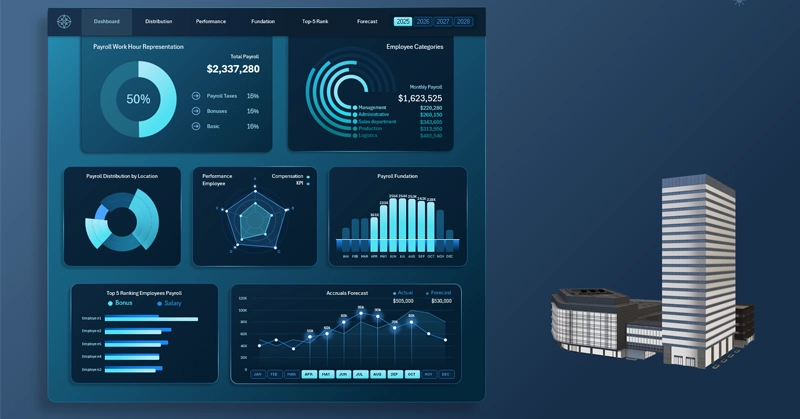
How an Excel Chart Reveals the Gap Between KPIs and Compensation

Excel radar chart: the green outline represents the financial compensation level, and the blue one shows actual KPIs across six employee categories; the gap between the polygons highlights areas of under- and overpayment.
How to set up this tool and what it will tell you on day one is shown in the tutorial video below. It walks through chart design configuration and how to interpret the results.
To learn how to effectively use a radar chart on an interactive dashboard, we recommend the Excel template with a ready-made example:
Excel Dashboard Template for Payroll Fund Management
There you'll learn how to read a radar chart: where compensation is outpacing results — and where an employee has long been working at a loss to themselves.
Correlating compensation with KPIs isn't a one-time audit — it's an ongoing management process. A radar chart in Excel makes that process visual and accessible without any specialized software: all you need is up-to-date data and a clear sense of what you're looking for within the intersecting polygons. Companies that regularly compare these two contours are less likely to be caught off guard by the sudden resignation of a key employee, and they build more accurate compensation budgets for the next cycle. The radar doesn't hand you answers — but it asks the right questions at the right time.
 Download the Radar Chart for an HR Dashboard in Excel
Data Visualization Charts for Interactive Report Creation in Excel.
Dashboard Templates