Download examples of data visualization for evaluating indicators in Excel
Links to free spreadsheet documents and data visualization based on charts or charts.Download off-the-shelf reporting solutions
 Epic Burndown Chart in Excel Dashboard Project Management.
A visual tool for agile project management in Excel using an epic sprint task burn-down chart. A classic, highly readable design for easy perception of data visualizations.
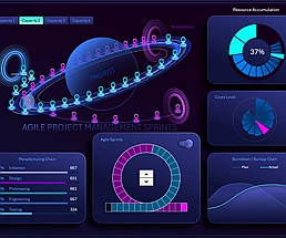
 Sprint cycle for agile project management in Excel.
Download the agile project management dashboard template featuring a sprint cycle and task burn-down chart. Example of creating dynamically adjustable data visualizations in Excel.
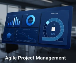
 Showcase Agile Project Management Dashboard in Excel.
Excel dashboard with sprint cycle infographics designed as a planetary orbit around the project. An example of how to create a custom interactive chart with a unique and visually striking design.
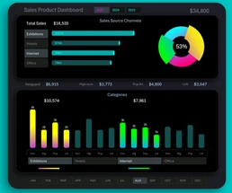 Simple and useful Excel Sales Dashboard for Small Business.
An example of a simple yet highly practical dashboard for testing a product assortment across different categories and markets in a small business. Profit is not the main goal!
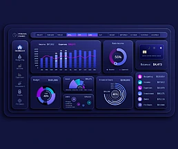 Best Dashboard for Personal Finance Management in Excel.
Download the dashboard template for the most effective management of personal expenses and income in Excel. It also includes management of personal investments, debts, and financial goals.
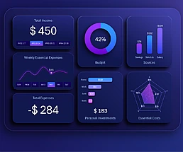
 How to Manage Personal Finances in an Excel Dashboard.
Download the personal finance management dashboard template with financial goal planning and tracking functions in Excel. Advantages: heatmap, interactive expense structure chart, and Gantt chart.
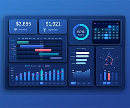
 Excel Dashboard for Weekly Personal Finance expense track.
Download the weekly Excel dashboard for interactive income and expense analysis. What is more important than money itself? The ability to manage it – gain valuable skills with visual satisfaction.
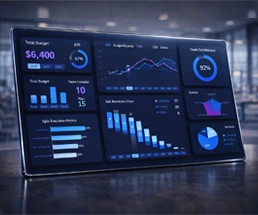
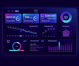 Agile Project Management Excel Dashboard for Personal Finance App.
Download the dashboard template for Agile project management of personal finance app development in Excel. 4 different dashboard designs in one file.
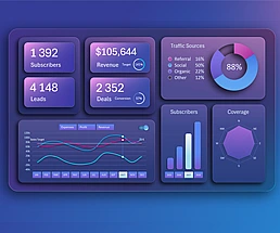 SaaS Sales Dashboard for Business Planning in Excel.
Download the interactive SaaS sales planning dashboard template. Benefits of attracting clients through small business product and service subscriptions.
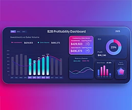 Excel Dashboard for analyzing product investment ROI.
Download the interactive Excel dashboard for B2B distributors. Analyze investment profitability in purchasing, control revenue, sales, and payback for business growth.
Excel Dashboard Templates for Business

Data Visualization Charts for Interactive Report Creation in Excel.
Dashboard Templates