KPI Dashboard for Project Viability Management in Excel
A dashboard presentation for managing the survival of a new business project through monitoring and adjusting KPI plans. The Excel template will help you develop strategic planning skills for a sustainable market entry or the creation of a new market.
How to Manage Project Survival Using KPIs in Excel
The first goal of any startup is to survive! Every project that survives is already successful by definition. It gives its owner an undeniable first-mover advantage in the market:
- The right to become synonymous with an entire niche.
- The ability to capture a monopoly market share.
- Locking in the best resources and customers before any alternative even exists.
It's worth taking a closer look at dashboard templates for managing and monitoring the survival of new business projects.
To manage something, you must first master it. To master something, you must first study it. Every study begins with defining the basic concepts.
The word "project" has no single definition. Different business and economics books define it through different concepts.
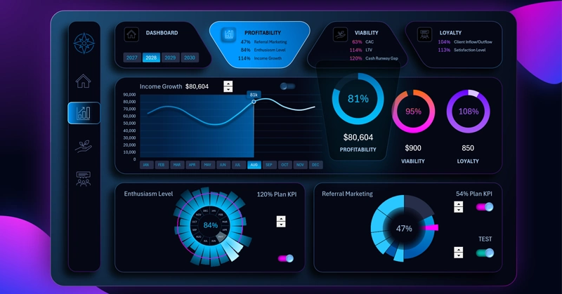
Excel KPI Dashboard — PROFITABILITY
What Is a Project — Defining the Concept
A project is managed chaos for creating, testing, and launching new business processes. It is the path to the first successful end-to-end iteration, after which uncertainty disappears and the result is handed off to a regular, repeatable system for producing products or services.
To make it clearer, here is a simple formula:
Idea → Hypothesis → Project (qualitative hypothesis testing) → System (quantitative hypothesis testing) = Product (the result of all tests)
It is within the project that a system capable of creating products or services is born from the chaos of hypothetical abstractions!
Interesting fact: Chaos does not exist in the universe! What we call chaos is simply order that ended up in the wrong place. And entropy, which we usually perceive as chaos, is not destruction — it is the process by which the universe puts everything back in its true original place.
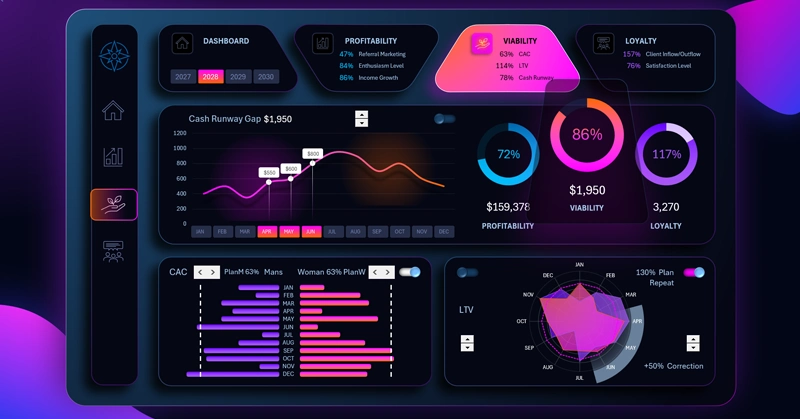
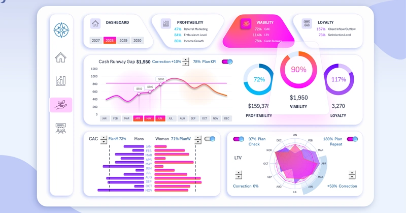
Monitoring the Viability Level of a Business Project
This version of the dashboard for monitoring the sustainability and survival of projects uses 3 key metrics:
- CRG (Cash Gap).
- CAC (Customer Acquisition Cost).
- LTV (Customer Lifetime Value).
The key insight: how are these project survival metrics interconnected, and what does that give us?
Imagine a company has a high LTV : CAC ratio of 4:1. Investors should be giving a standing ovation, right?
Not so fast. If the customer acquisition cost takes no less than 18 months to pay off (the so-called CAC Payback Period), and the cash gap is 6 months — the company will already be bankrupt a full year before customers start generating net profit.
Conclusion: A high LTV is encouraging, but a business survives not on promises of future LTV, but by managing cash gaps right now. Budgeting and expense control matter more than revenue growth. Reliable systems can always scale confidently with additional financial resources, compensating for a slower growth rate. In strategic planning — sustainability always beats brilliance!
Never confuse hypothesis testing with actually executing Key Performance Indicator plans!
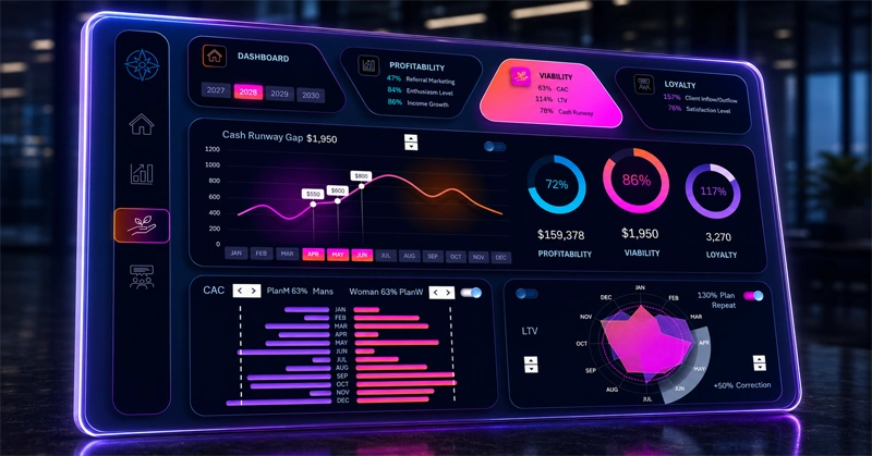
Interactive Line Chart of Monthly Cash Gaps
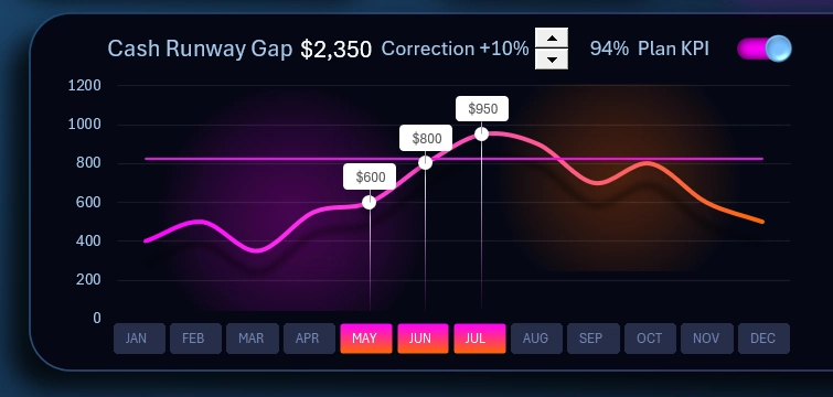
In the main visualization block of this dashboard, we analyze the dynamics of monthly cash gap changes throughout the year.
The horizontal straight line is the KPI plan retention level for cash gaps.
Since a project is a process of testing hypotheses, users are given the ability to adjust the level directly on the dashboard using an interactive element — a spinner control. This is a standard tool from the Excel Developer tab, designed for managing forms in Excel.
As shown in the figure: the KPI plan was adjusted by +10%. Next to it, the actual KPI completion percentage is displayed, automatically recalculated to reflect all adjustments.
In the upper right corner there is a custom toggle to hide or show the horizontal plan line on the visualization.
Along the horizontal X-axis, where the abbreviated month names appear, there is a block of interactive pivot table slicer buttons for Excel.
This gives users the ability to control cursors for selecting and highlighting data for a specific reporting period. You can select one month or multiple months simultaneously to analyze various reporting periods:
- month;
- quarter;
- half-year;
- full year;
- peak sales period;
- low-activity season, and more.
Each cursor for each selected month displays the current monthly cash gap value. If multiple months are selected simultaneously, the total combined value for the selected reporting period is shown on the main scoreboard next to the visualization block heading.
The authority to switch data by month extends across the entire dashboard and all of its main and child screens — well beyond this block, and across all visualization blocks on other sheets of the template.
The pivot table slicer button block for switching by year also holds global authority. It is located in the dashboard header on the first card of the main menu:
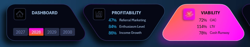
Multi-year selection is also supported, and all data across all visualization blocks on all dashboard screens updates automatically and accordingly.
Summary Charts for All Dashboard Screens
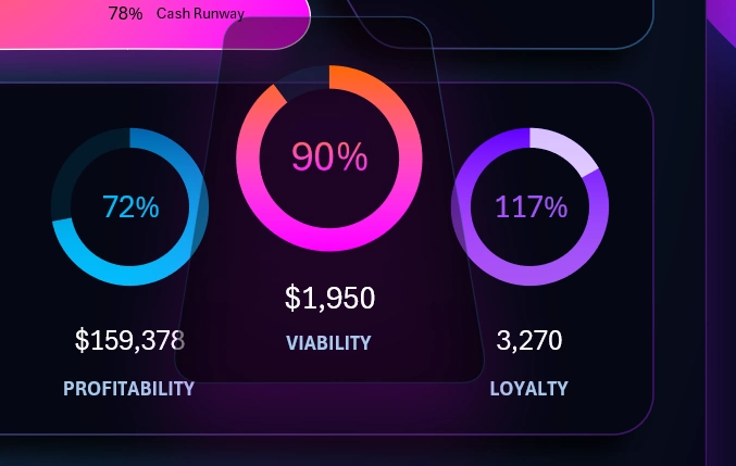
To the right of the cash gap line chart is a visualization block with summary charts for all three dashboard screens:
- Project profitability.
- Business project survival.
- Customer loyalty to the business — brand.
Final values for different KPI plan completions are shown in both relative percentage and absolute values.
Each summary chart is an averaged metric across all completed KPI plans. For example, on this screen the chart displays the average overall completion progress across the three KPI plans for: CRG (cash gaps), CAC, and LTV.
This summary chart block also functions as a navigation menu for switching between other child dashboard screens. Clicking on any summary chart will automatically open the corresponding dashboard. The chart itself will be brought to the foreground and displayed in a slightly enlarged size.
Interactive Butterfly Chart for CAC Analysis in Excel
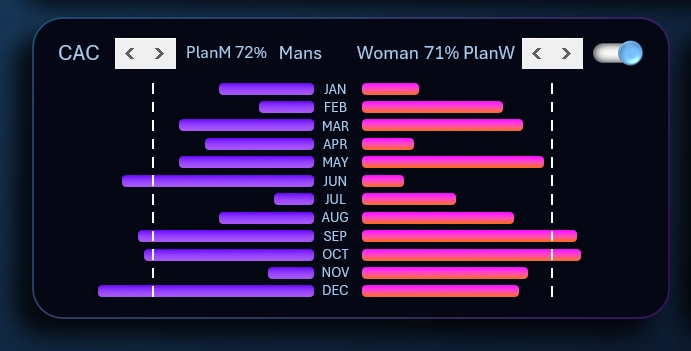
This is a highly informative visualization block. The data structure is divided into two basic customer segmentation categories by gender: male and female. This is important for accounting for the project's target audience. Accordingly, data on men and women is best kept separate for a fair KPI plan target. This produces cleaner statistics that immediately reveal the best points of focus for achieving results as effectively as possible.
The vertical plan levels are managed using Excel form controls — a scroll bar in horizontal orientation. The closer the KPI plan level line is to the center, the lower its value and the more achievable it becomes.
This way, CAC planning strategies can be developed simultaneously for two customer categories: male and female. The interactive elements allow plans to be adjusted based on the target audience and the overall business model strategy.
In the upper right corner there is a toggle to temporarily hide the plan lines, making the dashboard cleaner and less cluttered when needed at a given moment.
Customized Radar Chart with Cursor in Excel
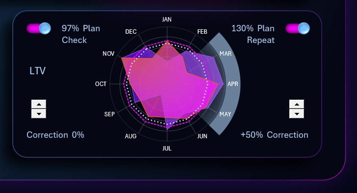
The Radar chart displays two types of distribution data:
- Monthly average order value.
- Number of loyal customers by month.
Here you can track correlations between the average order value and the number of repeat customers throughout the year.
Each metric has its own KPI plan level. Two interactive elements allow adjustments to their levels. On the chart, the active months used for analysis are highlighted by the cursor. When switching months on the main dashboard visualization block, the abbreviated names of the selected months are highlighted accordingly.
When switching the dashboard data by year, the Radar chart will update automatically and accordingly.
A Design Masterpiece Dashboard in Excel
The dashboard design also includes a light version for comfortable use during daytime hours:
The attractive KPI dashboard design style effectively captures attention for presenting reports in Excel:
Download the KPI Dashboard for Project Survival in Excel 
This template is a vivid example of how Excel is capable of far more than users expect from it. Standard tools can unlock an entire world of interactive data visualization with striking design for report presentations. Sell your reports more effectively to your employers using our Excel templates. Advance your career significantly faster. Now your work is easy to notice. Aesthetic value has the greatest influence on emotions. Logic is also important, but only to justify to the mind the rationality of a decision already made under the influence of emotion.

Data Visualization Charts for Interactive Report Creation in Excel.
Dashboard Templates