Free Charts in Excel for Dashboard Development
Interactive charts make an Excel dashboard dynamic and easy to analyze. They allow users to manage data display, choose categories, change periods, and quickly find key insights. This approach improves visual design and increases the efficiency of working with data.
Dynamic chart templates for Excel dashboard design
Interactive charts enable a deeper understanding of the data by revealing trends, anomalies, and relationships between metrics. Users can model scenarios, compare results, and quickly obtain answers to management questions, which significantly speeds up decision-making and turns the dashboard into a tool not only for visualization but also for strategic analysis.
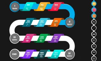 Developer Roadmap for Presentation in Excel Template.
Make sure your development process is always on track! Example Excel template for an interactive developer roadmap chart with quarterly breakdowns for Dashboard.
 3D Roadmap Template for Excel Dashboards Template.
The template is designed to give your roadmap an elegant, appealing design for presentation. It is important to maintain clarity and ease of use while utilizing interactive 3D data visualization.
 Small Business Dashboard for Luxury Packaging in Excel.
Download the dashboard template for managing a small business in luxury packaging production and sales. Your own small but highly prestigious and high-margin business for modern market conditions.
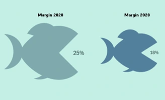 Animated Infographic Fish Chart for an Excel Dashboard.
Download the animated shark infographic template, created using charts and shapes in Excel. A creative way to present data on dashboards for maximum audience engagement.
 Polar Chart for Project Data Analysis in Excel Dashboard.
Download the Polar chart template, built on the spider chart format. Analyze project data effectively using visual representations of key metrics.
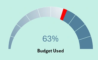 Speedometer-Style Progress Bar as an Excel Dashboard Widget.
Download the speedometer-style progress bar template for data visualization. Combining charts and shapes enables the creation of advanced visualizations with both aesthetic and functional designs.
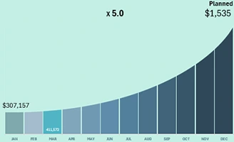 Interactive Exponential Growth Bar Chart Template in Excel.
Download the interactive bar histogram template for exponential growth analysis. A new approach to presenting the exponential curve in Excel for data visualization on a dashboard.
 Task Manager Menu in Excel for Project Progress Analysis.
Download the task manager template for a project progress management dashboard. Task segmentation into processes for an interactive data visualization menu.
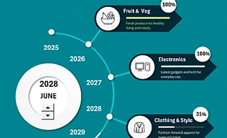 Interactive Roadmap in Excel for a Project Dashboard.
Download the interactive timeline template for presenting project development progress as a roadmap. A practical example of how interactive visualization can help track task completion.
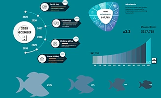 Project Development Management Task Manager in Excel.
Download the presentation template for interactive analysis of project development progress on the dashboard. A practical example of how to present data on task execution, timelines, and resources using data visualization.
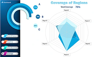 Coverage of Products on a Radar Chart in Excel by Regions.
Download the customized Radar Chart template for an interactive presentation of reach across three different product categories. A dashboard for ABC sales reach analysis by region.
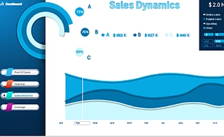 Example of a Sales Comparison Dashboard in Excel.
Download the template for an interactive presentation of comparative ABC analysis of product sales trends. Learn how to use Excel visualization for effective data comparison.
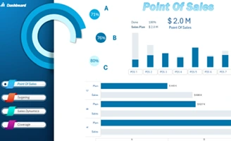 Sales Point Management Dashboard in Excel for POS Systems.
Download a dashboard template for analyzing sales of three product categories at seven different retail points. Interactive data visualization in Excel for POS systems.
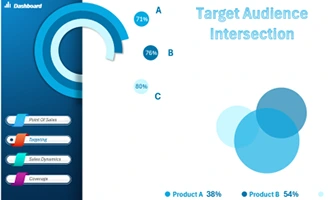 Target Audience Market Overlap Dashboard Template in Excel.
Download the dashboard template for presenting target audience market overlaps across three product categories. Improve decision-making with clear and actionable insights from data visualizations.
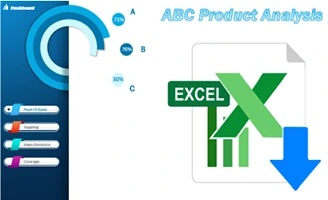 Interactive ABC Analysis Dashboard Template in Excel.
Download a dashboard template for performing ABC Analysis and presenting a report in interactive mode. An example of how to create a creative design for a presentation in a multi-layered and business style.
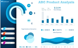 Dashboard for Managing ABC Sales Analysis in Excel.
Creative design for presenting ABC analysis reports across various product category indicators. What is ABC analysis in Excel? A ready-to-use dashboard template example, available for free use.
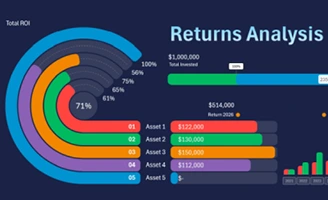 Investment Portfolio Tracking Excel Dashboard Template.
Download the dashboard template for tracking and managing an investment portfolio in Excel. Watch the video tutorial on creating an interactive dashboard to monitor investments.
 3D Infographics for Reports in Excel Template.
An interactive report allows you to visualize and analyze your company's financial performance regarding the budget balance. Download an example of 3D infographics for an impactful presentation of reports in Excel.
 Impressive 3D Stacked Bar Chart in Excel Template.
Download the curved 3D arrow chart template. A video example of how to easily create a beautiful and functional 3D bar chart for animated infographic presentations.
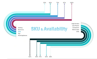 Excel Chart for SKU and Product Availability.
Learn how to create an Excel chart to effectively track SKU metrics and product availability using interactive templates. Download the mini Excel dashboard for an example.

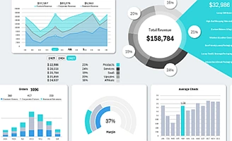
Data Visualization Charts for Interactive Report Creation in Excel.
Dashboard Templates